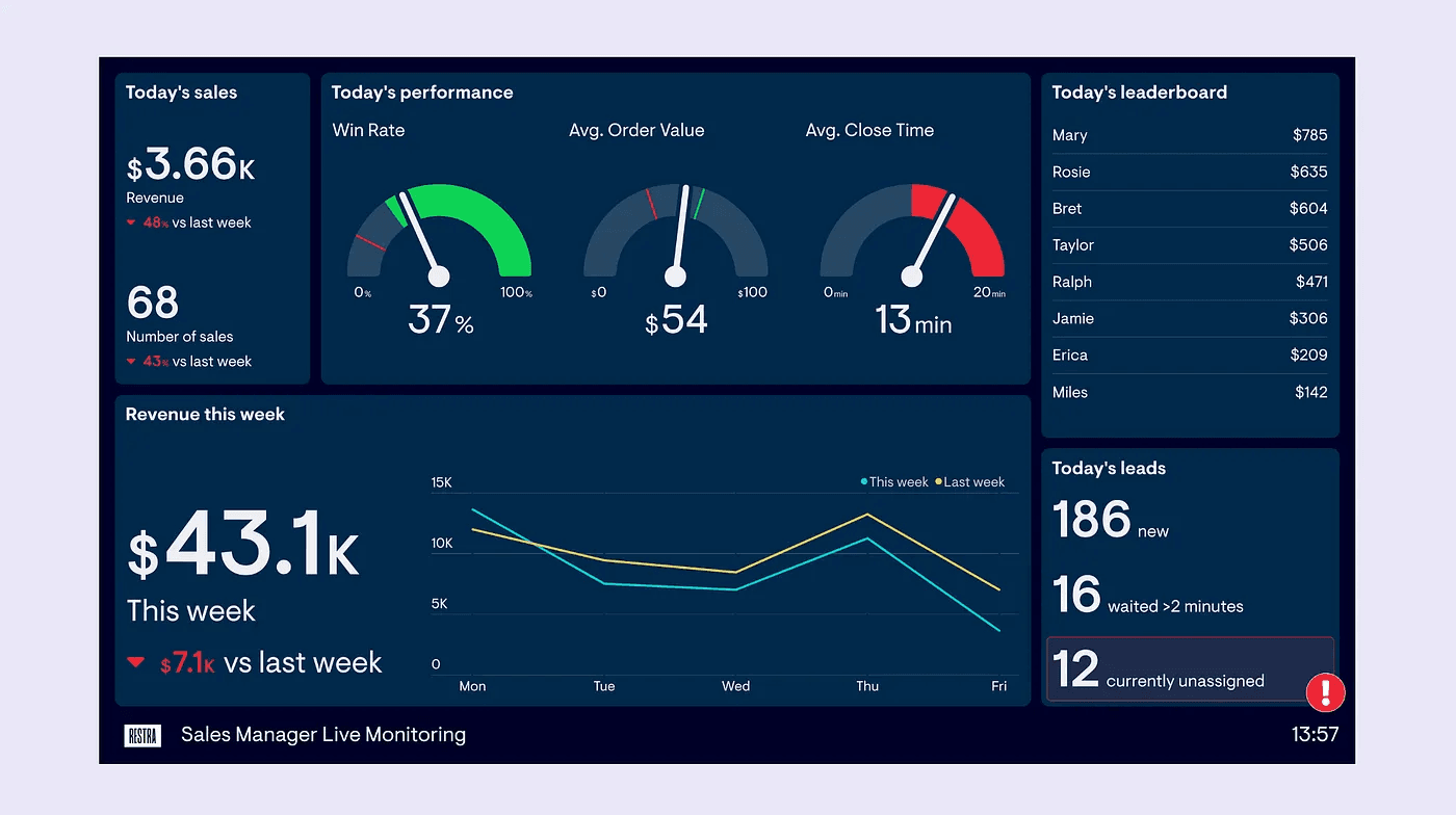
If you’re looking to take your Tableau dashboards to the next level, Uday Gundu provides a fresh perspective on how to combine the power of Tableau’s data capabilities with thoughtful design principles to create dashboards that are not only visually appealing but also deeply insightful. Her post offers practical tips on choosing the right visual elements, designing with clarity in mind, and ensuring that your dashboard tells a compelling story. It’s an excellent resource for anyone who wants to make their dashboards not just informative, but truly engaging.
By exploring the key elements of dashboard design – from layout to colour choices and interactivity, she helps you understand how to present complex data in a way that’s easy to digest and action-oriented. You’ll learn how to avoid common pitfalls, make data accessible, and use Tableau’s features effectively to communicate your insights. If you’re ready to elevate your Tableau dashboards and deliver more impactful visualisations, this post will give you the inspiration and tools to create dashboards that are both beautiful and meaningful.


