Ever wrestled with a dashboard that needs a dozen-plus colors for different people—and ends up looking like a rainbow gone rogue? Nicole Klassen tackles this chaos by creatively using white borders to make key elements pop (like spotlighting Odysseus) while letting the color-coded structure of the story hold steady. It’s a smart and stylish way to keep your viz both polished and narrative-strong.
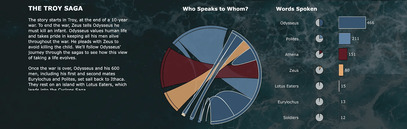

Tableau Training on
Tap Fast Track

Tableau Advanced Analyst

Tableau
Foundation

