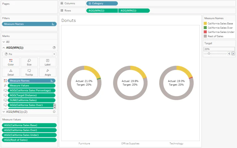
Donuts! Gwilym Lockwood shows you how to create dynamic reference banding in your donut charts in Tableau.
These donut charts could show the percentage of support tickets being answered by your team or whether your analytics department has under or over-performed for monthly sales or healthcare performance.


