Beyond just pretty visualisations, Kevin Wee’s dashboard is an invitation to question your assumptions. What do the divergences tell you? Are there hidden relationships between these two metrics you hadn’t considered? You’ll come away with hypotheses, questions, and, if you dig in long enough, ideas to test or act on. This is more than a dashboard; it’s a lens. Give it a spin – your intuition might just surprise you!
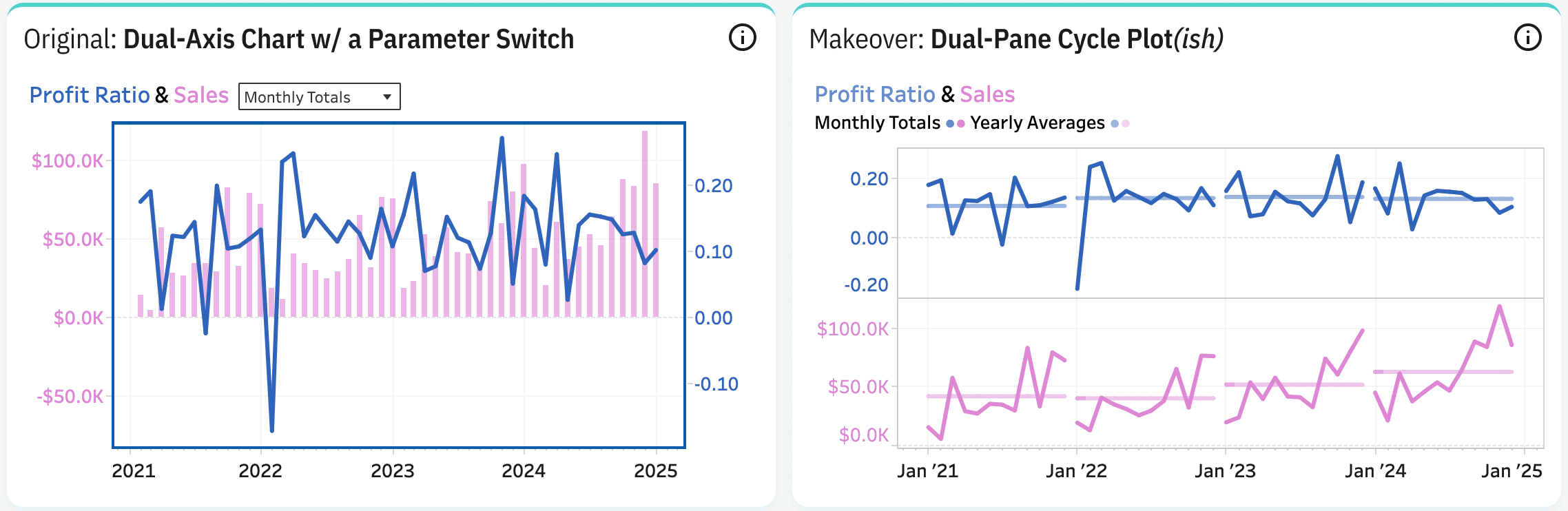

Tableau Training on
Tap Fast Track

Tableau Advanced Analyst

Tableau
Foundation

