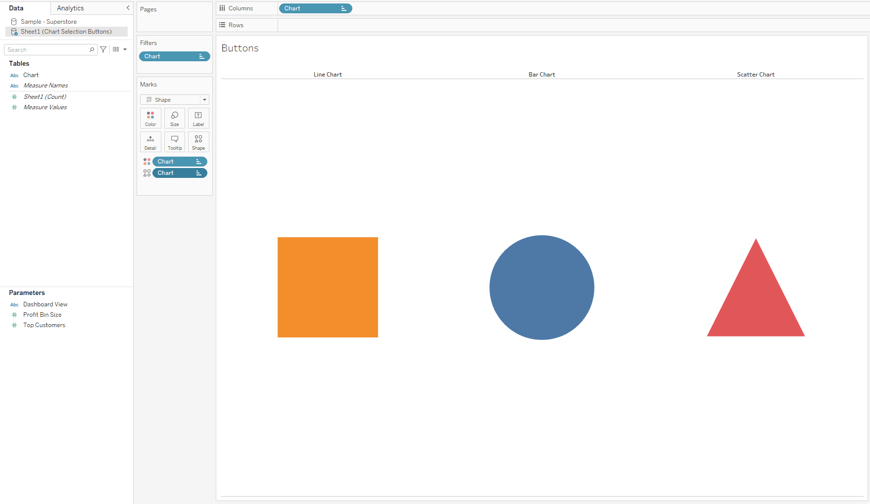
In this post, Liz Boika shows you how to use Tableau’s powerful zone visibility feature to control which dashboard elements appear based on user interactions. This adds a level of interactivity that allows users to explore your data in a more personalised way – creating a seamless experience that’s adaptable. Her guide provides practical steps to enhance your designs and maximise their impact.
By following Liz’s tips, you’ll learn how to set up dynamic zones to hide or reveal dashboard components in response to filter selections, parameter changes, or other user inputs. These techniques not only improve the user experience but also help you make your dashboards cleaner and more focused. If you’re ready to take your Tableau skills to the next level and create dashboards that feel more intuitive and responsive, Liz’s post will show you exactly how to get there with dynamic zone visibility.


