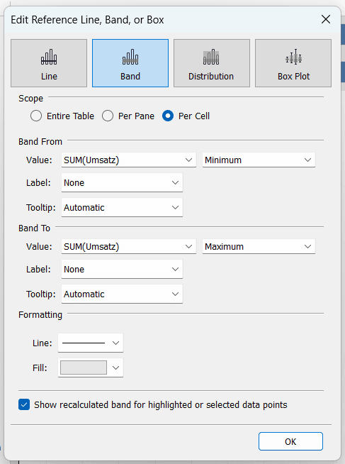
When it comes to data visualisation in Tableau, knowing how to use reference lines and distribution bands effectively can make a significant difference in how your insights are presented and understood. Olivia Esau explains their distinct purposes and when to use each one. Whether you need to highlight benchmarks, show trends, or add statistical context to your charts, mastering these tools will help you create more impactful and insightful dashboards.
If you want to enhance your Tableau visualisations without overwhelming your audience with unnecessary details, Olivia’s guide includes practical examples to help you apply these concepts, ensuring your data speaks clearly and effectively. Explore this valuable resource and elevate your Tableau skills today!


