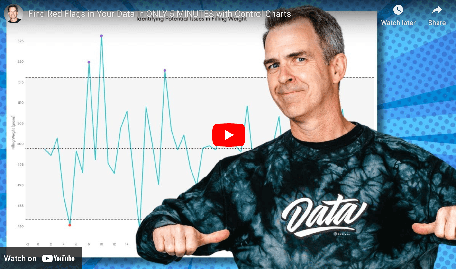
If you’re looking to enhance your data analysis skills, this post by Andy Kriebel is a must-read. It provides a quick, step-by-step guide on how to create control charts in Tableau – helping you monitor data trends and detect outliers effectively. By mastering control charts, you can easily identify points that fall outside expected limits, which is invaluable for quality control and performance monitoring.
His post offers clear explanations on adding control limits, reference lines, and colour-coding to highlight outliers, perfect for both beginners and advanced users. These charts are not only useful in manufacturing but across various industries – giving you the ability to spot red flags in processes with ease. Don’t miss out on learning this essential data visualisation technique!


