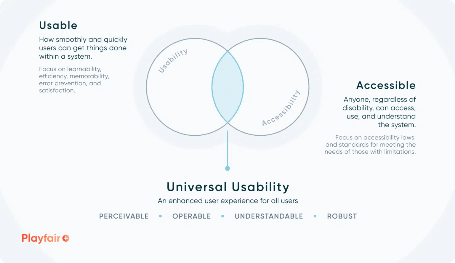
If you’re passionate about data visualisation and want to ensure your Tableau dashboards are accessible to everyone, the piece, by Rafael Simancas, highlights the critical importance of accessibility in design – breaking down key principles that help make dashboards more user-friendly for individuals with diverse needs. By focusing on aspects such as colour contrast, font choices, and layout design, he provides practical tips to create inclusive visualisations that everyone can understand and interact with. Adopting these accessibility standards not only enhances the experience for users with disabilities but also improves the overall usability of your dashboards for all audiences.
Accessibility is not just a compliance issue; it’s a vital aspect of effective communication and data storytelling. By implementing the strategies outlined in the post, you can create more engaging and effective dashboards that foster understanding and insight across a broader audience. This resource will equip you with the knowledge to make your visualisations truly inclusive. Don’t miss the opportunity to elevate your design skills and make your dashboards a more welcoming space for everyone!


