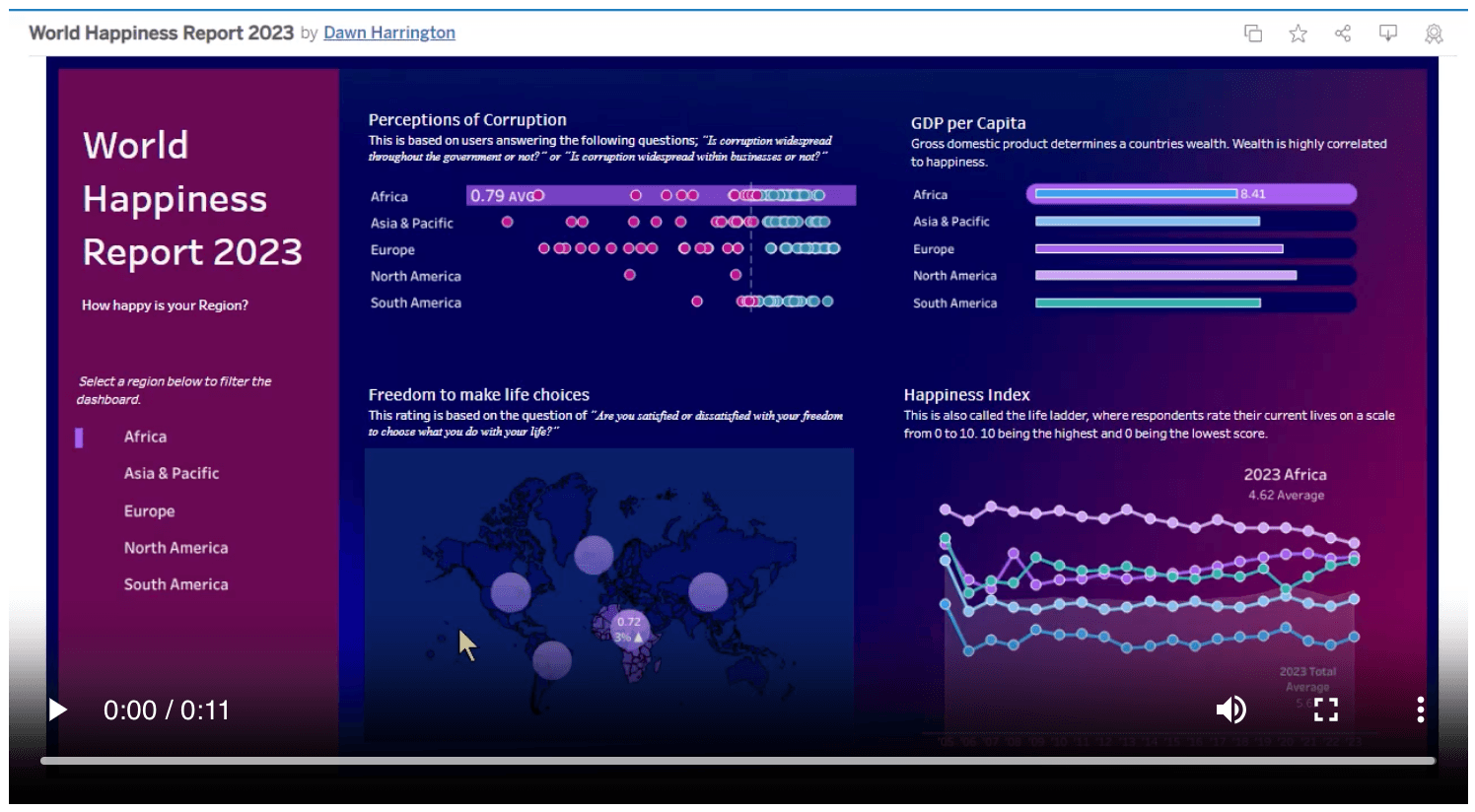
Looking to make your Tableau visualisations more dynamic and user-friendly? Dawn Harrington’s post is the perfect resource to take your skills up a notch. She walks you through how to apply selective highlighting to specific data points in dot plots or bar charts, making it easier for your audience to focus on key insights. This tutorial ensures you can easily integrate this feature into your dashboards, boosting interactivity and engagement.
Incorporating highlighting techniques allows you to emphasise critical data trends and comparisons without overwhelming your viewers. Whether you’re presenting sales figures, tracking performance, or showcasing any other type of data, mastering selective highlighting will give your visualisations a polished, professional look. Read on today and start creating visualisations that stand out and communicate more effectively!


