Dawn Harrington‘s breakdown helps us find a smart solution when you want to highlight differences between someone’s performance and the average without clutter or confusion. If you’re aiming to improve how you show comparisons in Tableau – especially for analytics reviews or performance dashboards – this short post offers clear, actionable techniques to elevate your visual storytelling. Read on today!
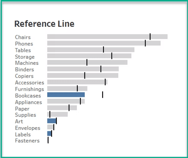

Tableau Training on
Tap Fast Track

Tableau Advanced Analyst

Tableau
Foundation

