Explore the intricacies of effective data visualisation with this compelling post by Steve Wexler (at Data Revelations) – delving into the often-debated topic of line chart design – offering readers a nuanced understanding of how to strike the perfect balance between clarity and detail. Whether you’re a data analyst, designer, or simply someone passionate about data storytelling, here are practical guidelines and illustrative examples that illuminate the art of creating impactful line charts. By addressing common pitfalls and presenting actionable tips, Steve equips you with the knowledge to enhance your visualisations, ensuring they convey your data’s story with precision and clarity.
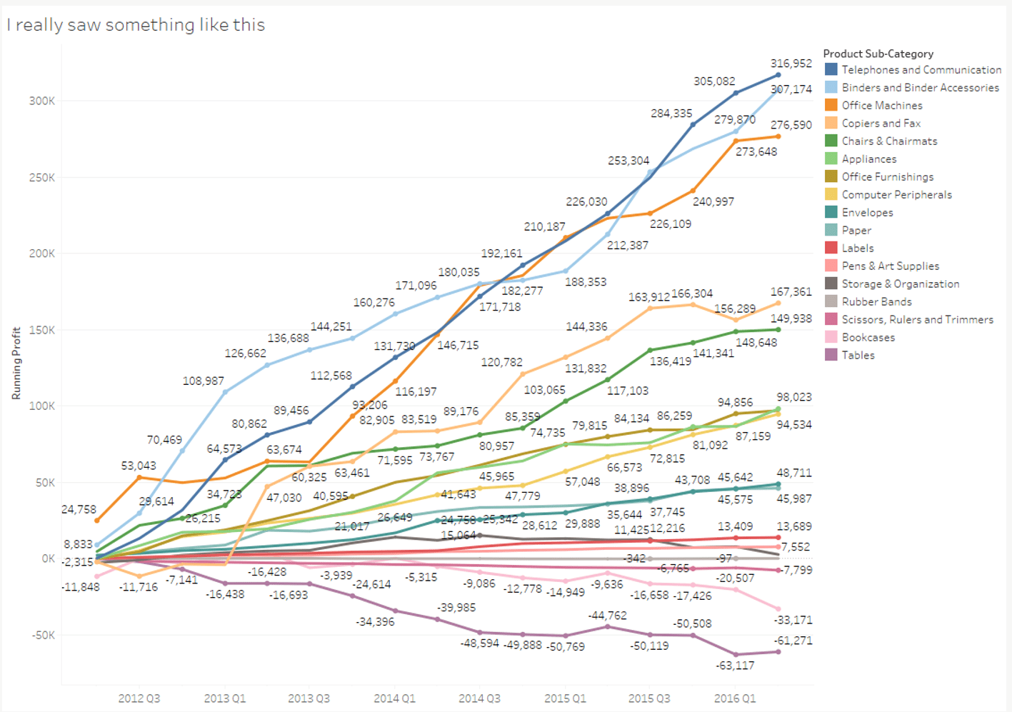
You’ll discover the importance of simplicity and readability in data presentation. Steve’s expert advice on managing line chart complexity will help you avoid clutter and confusion, transforming your charts into powerful tools for communication. Learn how to make informed decisions about the number of lines to include, ensuring that your audience grasps the key insights without being overwhelmed. Don’t miss the chance to refine your data visualisation skills and make your presentations more compelling and effective…


