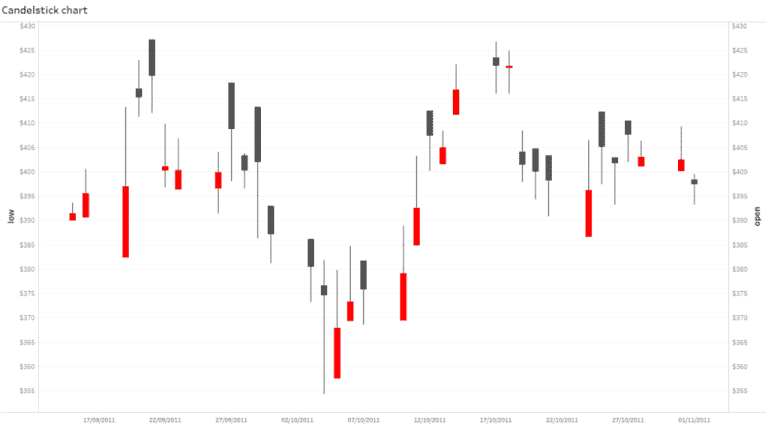
Starting off the final Tableau Bites of 2019 is Anna Prosvetova from The Information Lab’s Data School, who shows you how to build a candlestick chart in Tableau.
A candlestick chart is great for showing the fluctuating price changes in stocks and currency data, showing which days or months have shown a rise or decrease in prices. This is particularly useful for Tableau dashboard designers who work in the banking and stock market industries.


