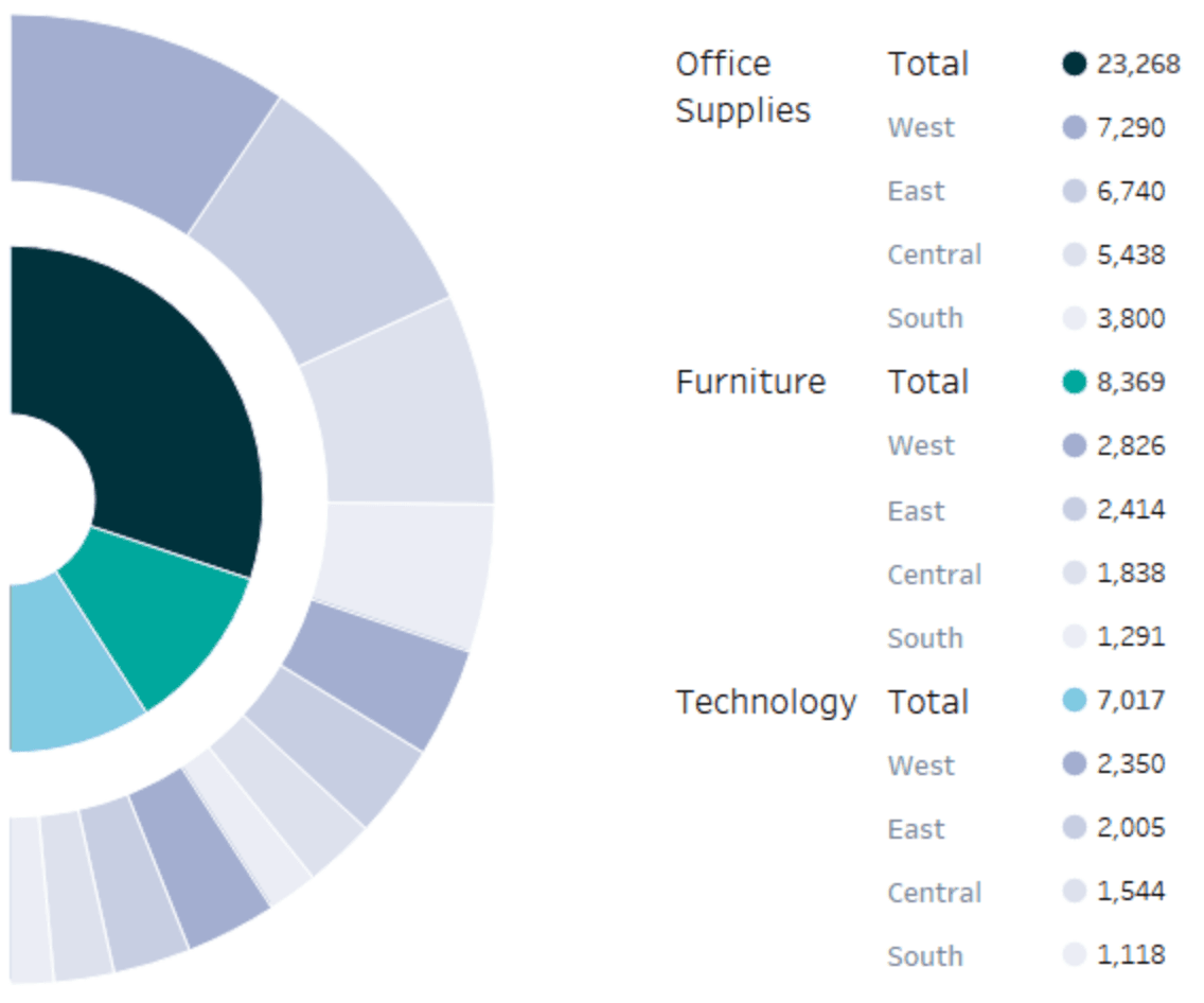
Felicia Styer’s tutorial introduces a dynamic way to display hierarchical data. Semi-sunburst charts are especially effective for showing relationships within layered data – such as organisational structures or category breakdowns. Her post provides a step-by-step walkthrough that’s clear and accessible.
This guide is especially valuable is its ability to teach you a unique chart type while expanding your overall Tableau knowledge. As you build the chart, you’ll also learn useful techniques that can be applied to a variety of other projects. You could be looking to impress your clients, enhance a report, or simply try something creative, this post offers both the instructions and the inspiration to make it happen. Diversify your Tableau skill set and add a powerful new tool to your visualisation toolkit!


