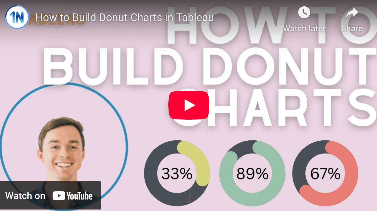
Ollie Linley (at OneNumber) provides step-by-step instructions to build a donut chart by calculating the percentage of total for your measure and its remainder, then layering a smaller circle on top to create the donut effect. This approach allows you to effectively display part-to-whole relationships in your data, enhancing the visual appeal and clarity of your dashboards.
By exploring this guide, you’ll not only learn a new charting method but also gain insights into best practices for data visualisation. Check out his post today!


