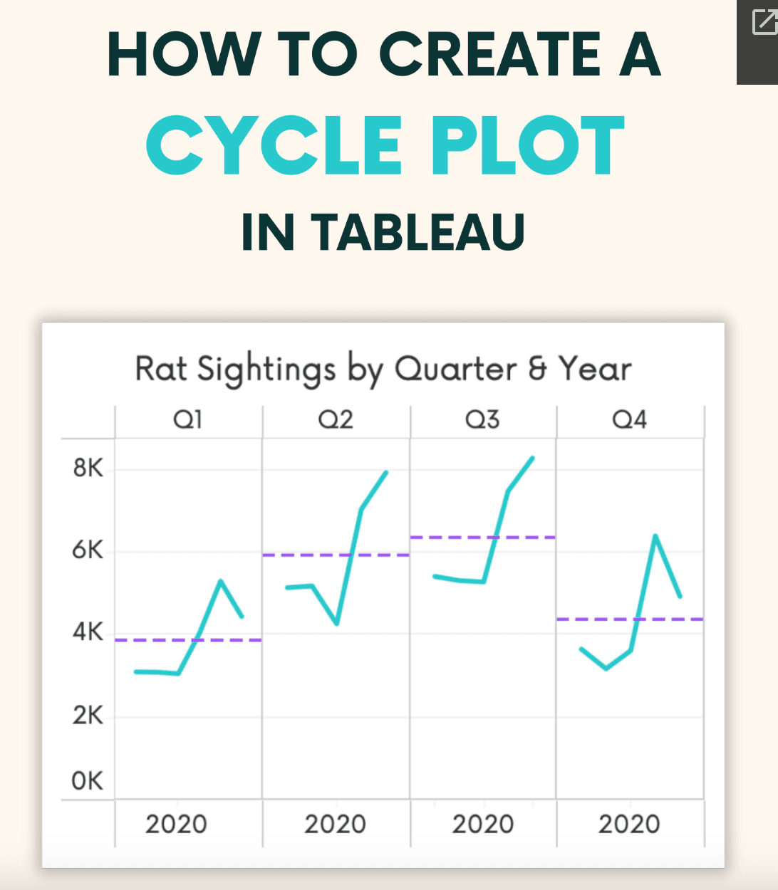
If you’re eager to take your data visualisation skills to the next level, this post, by Andy Kriebel is an excellent resource to explore. It delves into the concept of cycle plots – which are particularly effective for displaying cyclical trends and seasonal variations in your data. By presenting data over time in a way that highlights repetitive patterns, cycle plots allow you to uncover insights that might otherwise go unnoticed in traditional visualisations.
The article emphasises the importance of visual storytelling in data analysis. Cycle plots not only make your data visually appealing but also improve clarity and comprehension for your audience. You can help stakeholders quickly grasp complex trends and make informed decisions based on the visual insights you provide. If you’re looking to refine your analytical approach and effectively communicate your findings, read on today!


