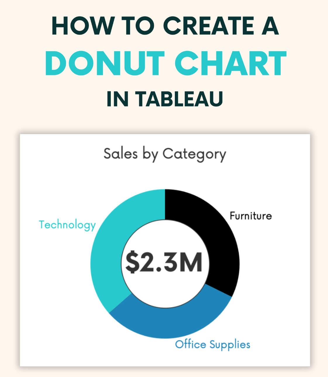
If you’re looking to add a fresh, visually-engaging element to your Tableau dashboards, check out Andy Kriebel at VizWiz! His post provides a simple, step-by-step approach to constructing a donut chart – making it an excellent resource for both beginners and seasoned Tableau users. Donut charts are perfect for showcasing proportions or percentages in a visually appealing way, and Andy walks you through the entire process, ensuring you can create them with ease. Whether you’re looking to improve the design of your data presentations or just expand your charting repertoire, this tutorial has you covered.
In addition to learning the mechanics of building a donut chart, you’ll also discover tips on how to make your visualisations more informative and user-friendly and practical insights on how to effectively communicate data through clear and concise visuals – making it easier for your audience to understand key takeaways. If you want to elevate your skills and make your dashboards more dynamic, continue reading!


