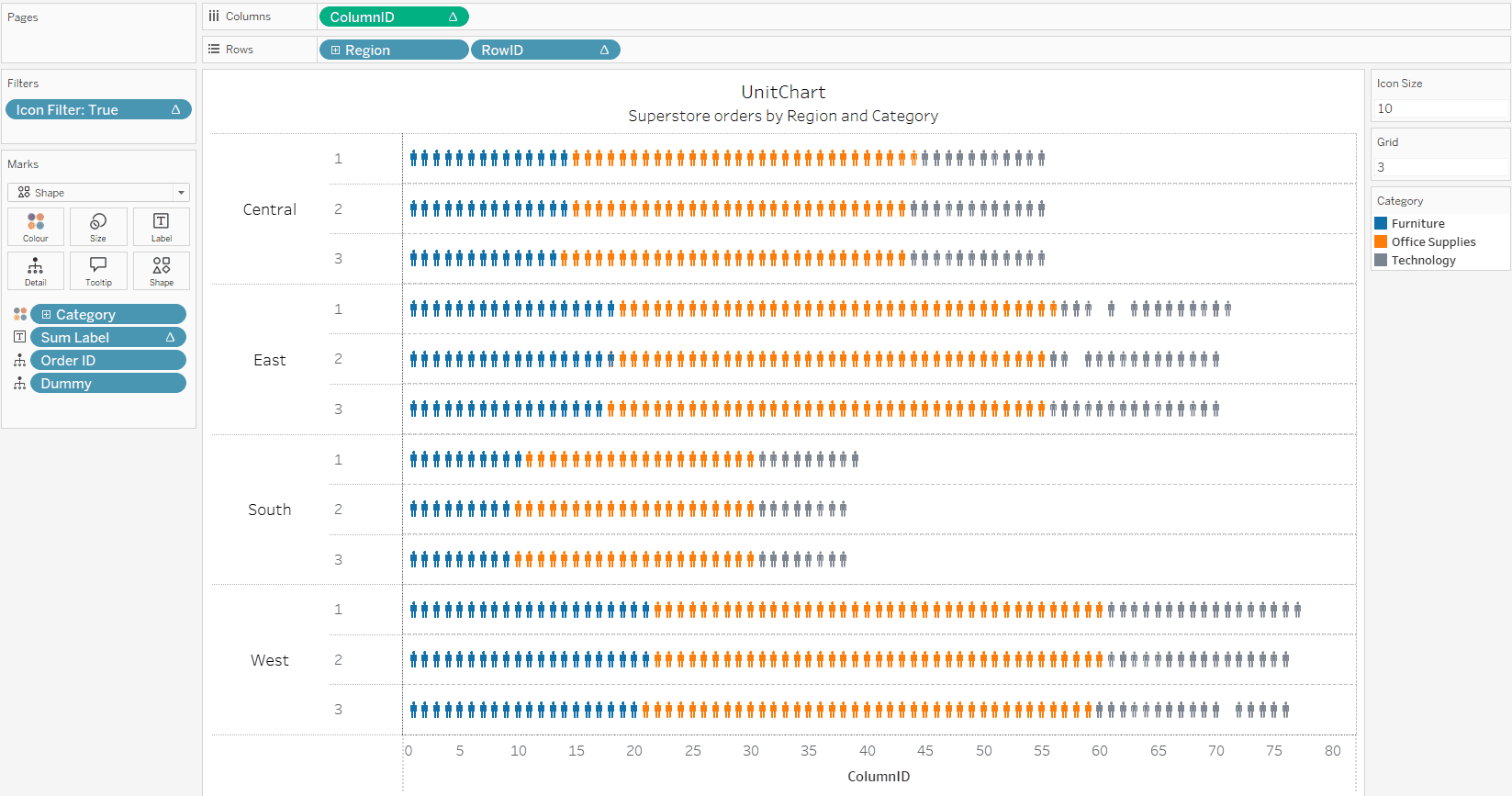
Thiago Santos’ guide breaks down what can seem like a complex visualisation technique into easy-to-follow steps – helping you understand both the “how” and “why” behind dynamic unit charts. Perfect for visualising metrics with individual icons or units that change based on your data, this technique adds a layer of engagement and clarity that makes your dashboards truly stand out. Whether you’re aiming to make data more accessible or just looking to add variety to your reports, this guide equips you with the tools to make your visuals more impactful.
With clear explanations and helpful visuals, the post ensures that you won’t get lost in technical details. By the end of this tutorial, you’ll not only have a new skill under your belt, but also a greater understanding of Tableau’s capabilities to create data visualisations that are both functional and beautiful.


