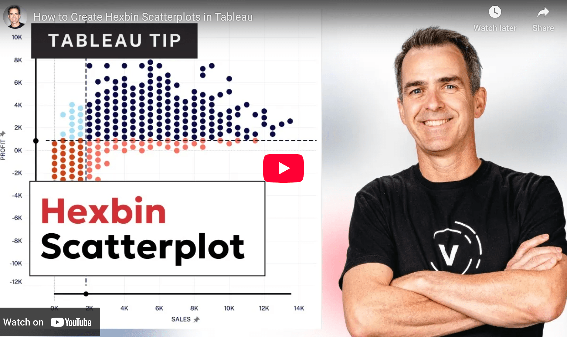
This isn’t just about aesthetics, it’s about deepening your data clarity. By replacing scattered marks with structured, colour-coded hexbins, you instantly improve interpretability and storytelling. Whether you’re exploring geographic distributions or high-volume metric comparisons, Andy Kriebel’s tutorial equips you with a tangible technique to elevate both clarity and impact in your dashboards.
How to Create Hexbin Scatterplots in Tableau
Want to Get Latest Updates and Tips on Tableau Bites Blogs
Sign Up For Newsletter


