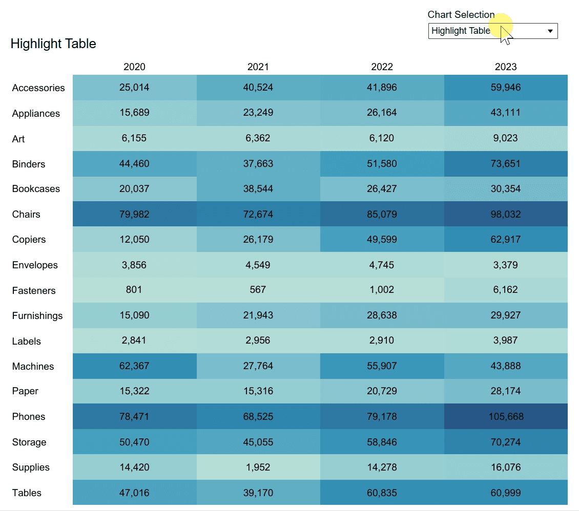
This step-by-step guide, by Dan Bunker, walks you through the process of creating heat maps – one of the most effective tools for identifying trends and patterns in large datasets. Whether you’re analysing sales performance, customer behaviour, or any data with a high volume of categories, heat maps allow you to pinpoint the areas that need attention instantly. His post is perfect for both beginners and experienced users who want to add a powerful visualisation tool to their repertoire.
What sets this post apart is the clarity with which it explains the technical process – making it accessible even if you’re not an advanced Tableau user. The tutorial not only covers how to build heat maps but also shares tips on customisation – ensuring your visualisations are as informative as they are visually engaging. If you want to elevate your Tableau dashboards, uncover key insights with ease, and communicate complex data more effectively, this guide is a must-read. Dive in and transform the way you present your data!


