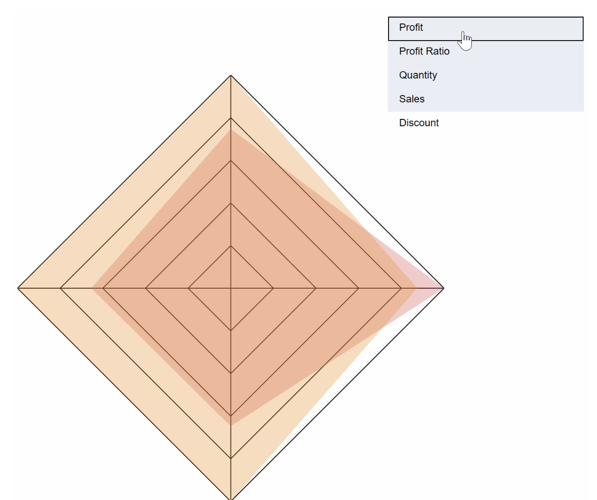
Spider charts, also known as radar charts, are perfect for visualising data with multiple dimensions in a way that is easy to interpret and aesthetically striking. Dan Bunker’s post walks us through the steps of creating one – helping us unlock a new dimension of data presentation that highlights relationships across multiple variables. His post shows us how to deliver insights in a visually-dynamic format.
You’ll learn how to make your visualisations more interactive – allowing users to engage with your charts more effectively. If you’re aiming to make your data come alive and improve how you communicate insights, this guide will provide tips for taking your Tableau skills to the next level!


