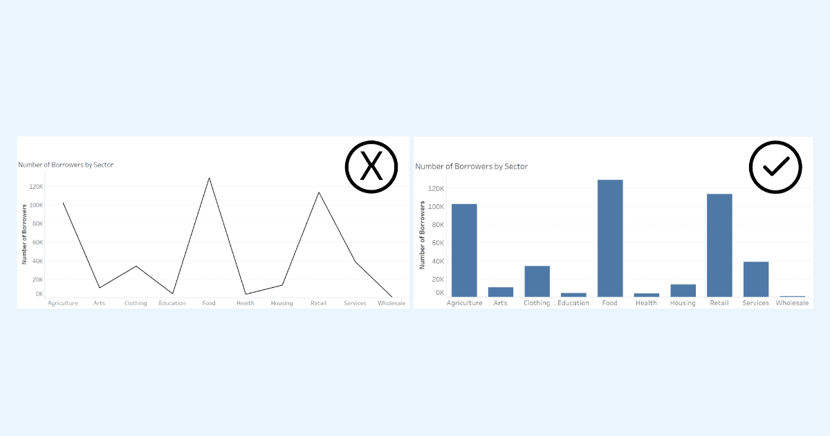
Being able to identify misleading charts is an essential skill in today’s data-driven world, and Sue Kraeme’s post (at Tableau) is your go-to guide for mastering it. She delves into the subtle (and sometimes not-so-subtle) ways charts can misrepresent data – whether through poorly chosen visuals, manipulated axes, or selective data presentation. By learning to recognise these issues, you’ll not only become a more discerning consumer of data but also improve your own chart-building practices to ensure accuracy and clarity. Sue’s post is a must-read for building your critical eye.
Sue has an actionable approach to improving your chart literacy. She provides examples of misleading designs and breaks down how to spot red flags like exaggerated trends, omitted data, or overly complex visuals. These insights are invaluable whether you’re creating dashboards or analysing reports, ensuring you can both communicate and interpret data with integrity. With clear explanations and practical tips, this article equips you to cut through visual noise and get to the truth behind the numbers. Dive into this post to sharpen your skills and contribute to a world where data is used to inform, not mislead.


