Emily Kund‘s post is more than just a guide; it’s a thoughtful examination of the balance between innovation and user-friendliness in data visualisation. Useful for anyone interested in pushing the boundaries of their data presentations while maintaining clarity and accessibility. Data analyst, Tableau user, or just a fan of creative data representation, this post offers valuable insights.
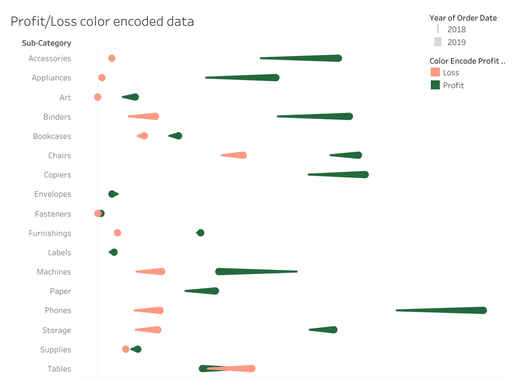

Tableau Training on
Tap Fast Track

Tableau Advanced Analyst

Tableau
Foundation

