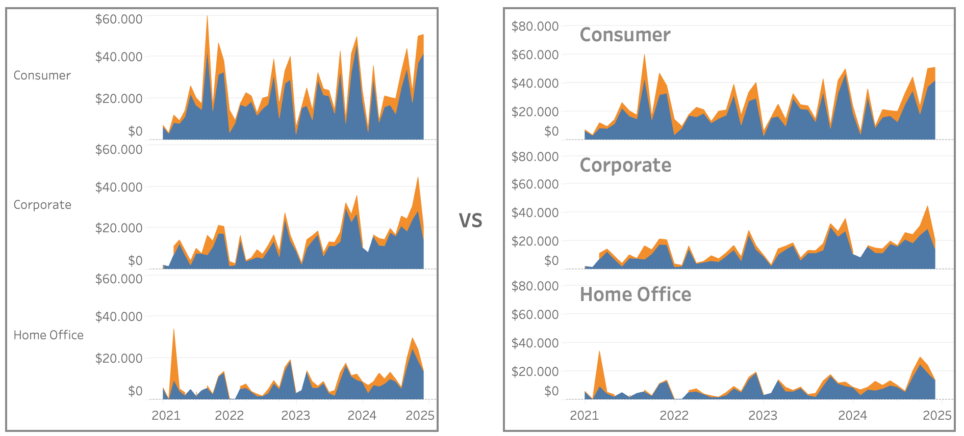
Whether you’re working with grid-based visualisations, trellis charts, or comparative layouts, Johan de Groot’s guide provides practical strategies to enhance clarity and readability.
If you’ve ever struggled with how to position or format titles in small multiple charts, this article is a must-read. Johan covers ways to improve context, hierarchy, and design to help viewers interpret data more efficiently. By applying these techniques, you’ll not only refine your Tableau dashboards or data visualisations but also improve the overall user experience. Don’t let poor labelling confuse your audience – learn how to make your charts work smarter and communicate better!


