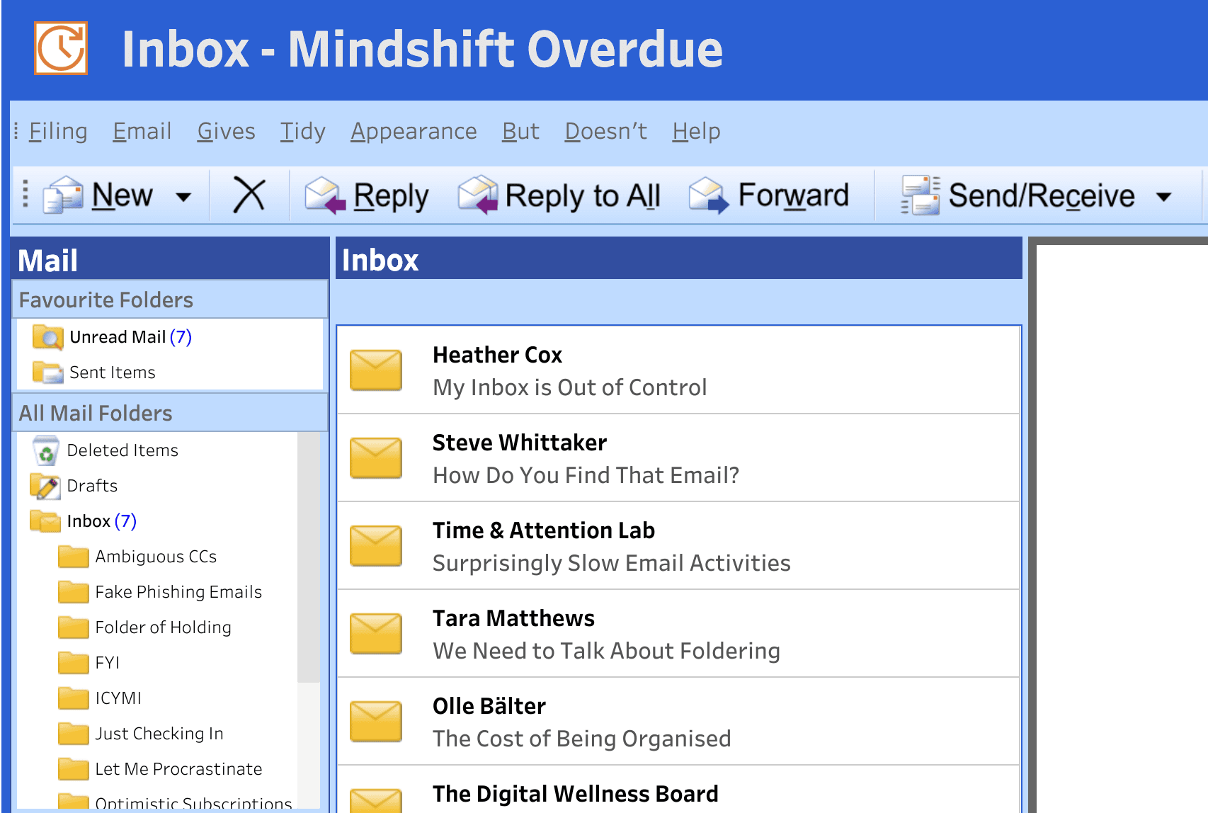
Interacting with real dashboards like this, by Heather Cox, helps you see how charts, design, and narrative come together to communicate insights clearly – something that’s valuable whether you’re building reports for work, academic projects, or personal exploration, and a great way to connect with the wider visualisation community and get inspired by the creative ways others use the tool.
Inbox – Mindshift Overdue
Want to Get Latest Updates and Tips on Tableau Bites Blogs
Sign Up For Newsletter


