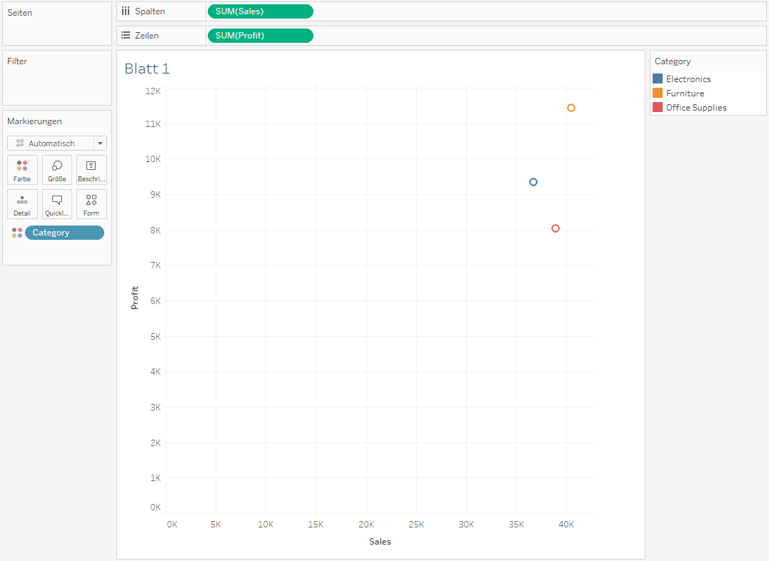
Unlock the full potential of scatter plots in Tableau with Marcus Oberdiek. He walks us through the process of making your scatter plots interactive and insightful. Instead of static visuals, you’ll learn how to create dynamic charts that let users explore data in a more engaging way. Analysing business trends, tracking performance, or just visualising complex relationships, these techniques will help you bring your data to life.
The perfect guide for Tableau users of all levels – offering clear explanations and practical examples that you can apply to your own dashboards. By mastering interactive scatter plots, you’ll improve the way you present and analyse data – making your visualisations not just informative but truly impactful.


