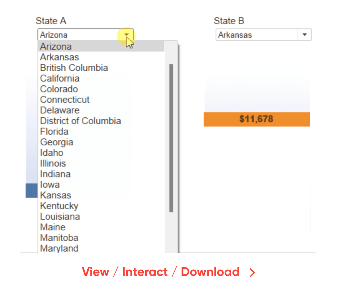
Dan Bunker provides a step-by-step guide, starting with connecting to Tableau’s Sample – Superstore dataset and creating parameters for the two groups to compare. With just four calculated fields, you can build a dynamic and interactive chart that responds to user input. Whether you’re comparing sales between regions, performance metrics across departments, or any other paired data, the Balance Scale chart offers a fresh perspective. This technique is a valuable addition to any Tableau user’s toolkit, enabling more engaging and informative dashboards.
Introducing Balance Scale Charts in Tableau
Want to Get Latest Updates and Tips on Tableau Bites Blogs
Sign Up For Newsletter


