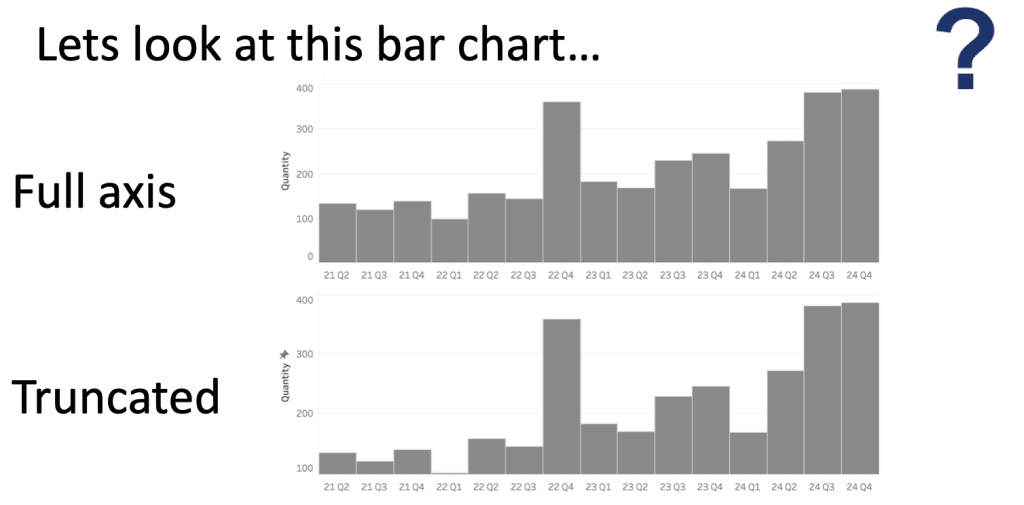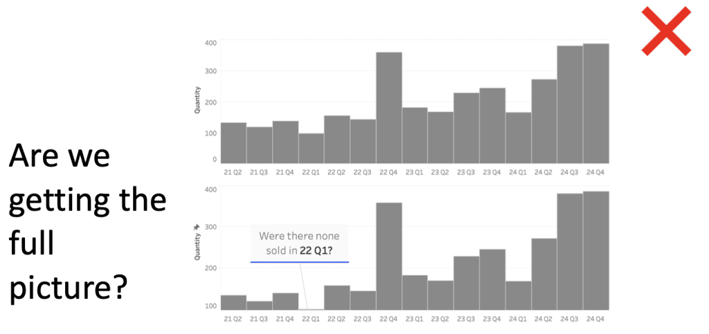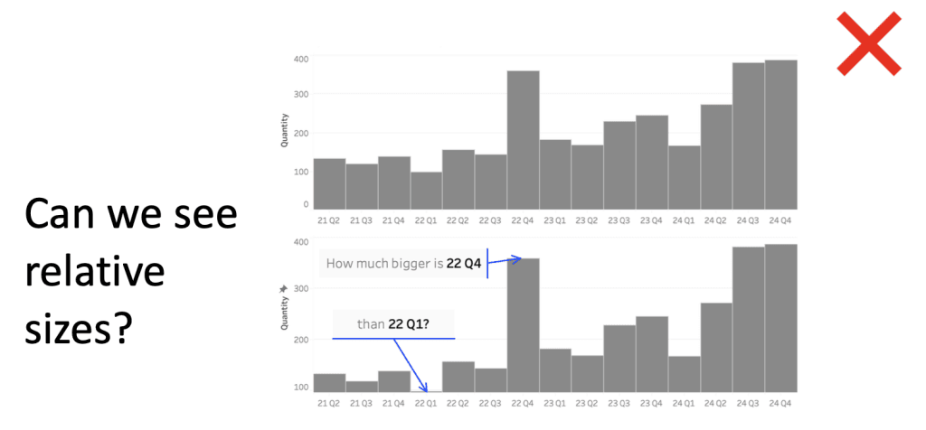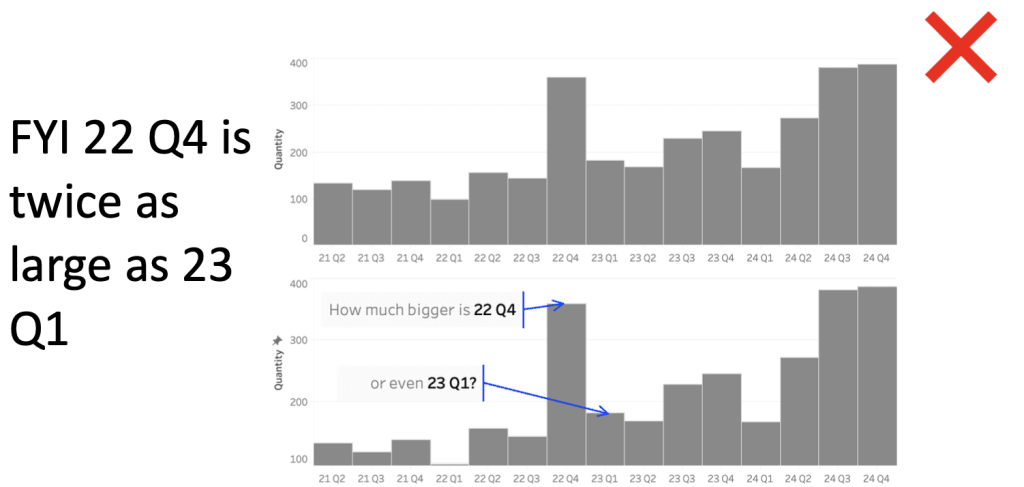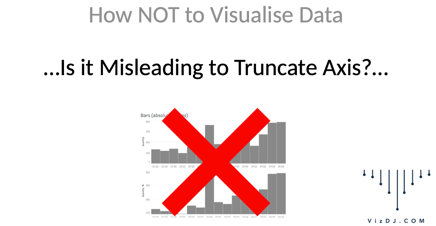
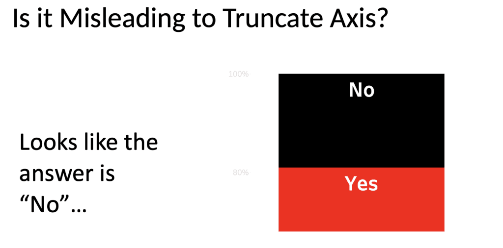
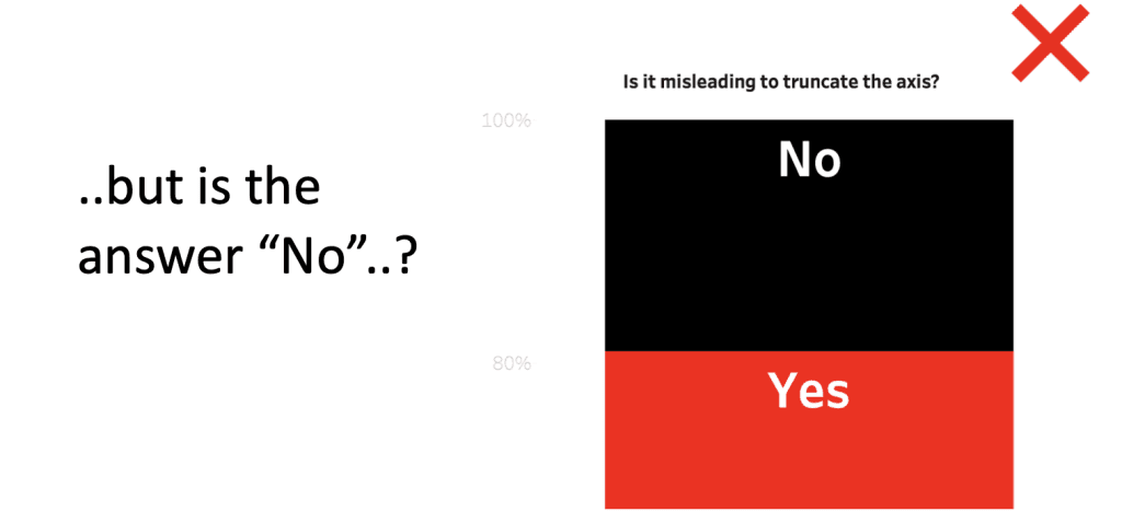
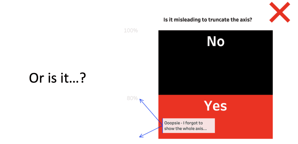
Is it misleading to truncate the axis? How NOT to Visualise Data…
Well, actually, research shows that there are various theories on this.
Here is the truncated version of that research.
(Ouch. Sorry. Couldn’t resist the pun…)
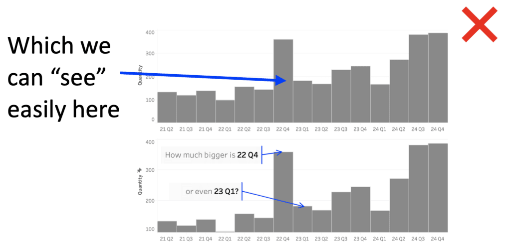
💡 The Zero-Baseline Principle: A y-axis should always start at zero, no exceptions. The rationale? Avoid exaggerating effect sizes. The rule here is simple: if you’re using a bar chart, keep the baseline at zero to maintain integrity. Cutting the y-axis? Not on their watch. This principle is ideal when clarity and trustworthiness are your top priorities.
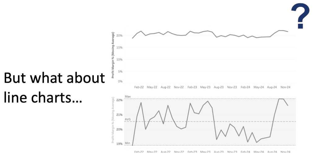
💡 The Line Slope Theory: A more nuanced approach—keeping the zero baseline for bar charts but allowing more flexibility for line charts. Why the exception? In line charts, we’re often more interested in the trend or slope, where absolute starting points are less critical. Here, it’s about capturing the narrative over time rather than rigid value comparisons.
💡 The Visual Cue Convention: This focuses on storytelling without losing transparency. If your data has an interesting range that doesn’t include zero, it’s acceptable to trim the y-axis—as long as you visually signal the change. Techniques like broken axis symbols or annotations make it clear that you’ve altered the baseline to zoom in on the action. The goal? A balanced story that’s both clear and honest.
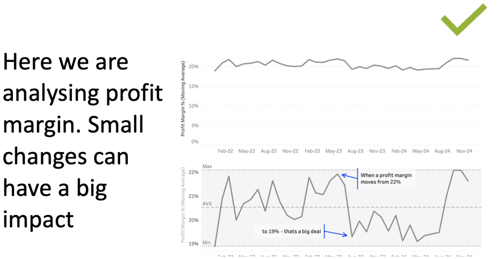
💡 The Effect-Driven Approach: The focus here is on the data’s impact rather than the zero baseline. In this view, starting the y-axis at the relevant range of the data brings the effect size to the forefront. This approach is about relevance: if zero doesn’t add to the story, then start the axis where it makes sense.
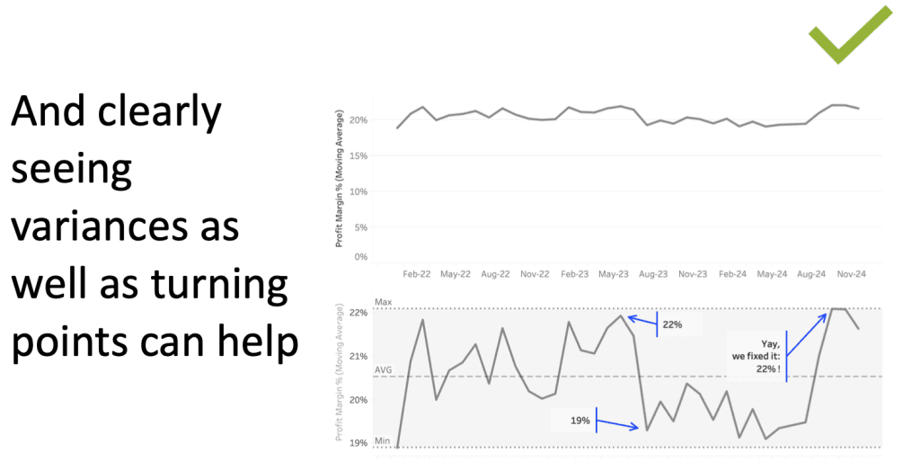
Want a good example for when it is OK? – If you’re measuring body temperature, for example, then 37ºC is normal but 38ºC is a fever, so truncating here absolutely makes sense here.
(A flat line in healthcare usually indicates something more serious…)
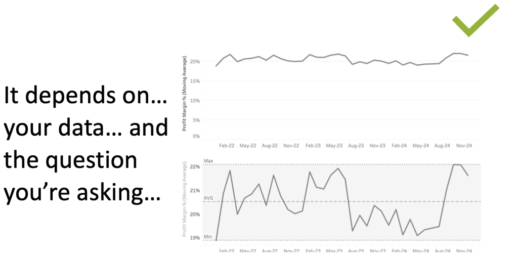
Each theory offers its own way of handling the y-axis, so…?
Know your audience, know your story, and pick the approach that delivers your insights honestly and effectively.
The below walks through some of these concepts! Steal it like an artist to help discuss these issues with your colleagues.
Enjoy!