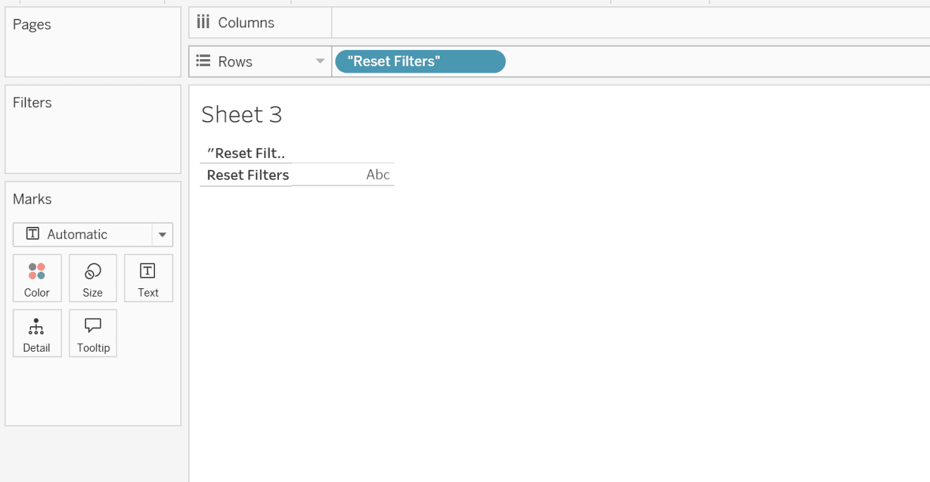
Here, Ann Pregler addresses a common challenge in Tableau: how to reset filters cleanly without causing distracting highlights that can confuse users. Ann breaks down a simple, effective solution that keeps your dashboard views pristine while empowering users to reset their data selections effortlessly. Whether you’re working on a dashboard for business insights, educational tools, or personal projects, this guide offers a quick way to improve functionality.
Enhance the visual appeal and usability of Tableau dashboards – a crucial aspect when trying to keep users engaged and focused on the data insights. Ann’s instructions make it easy for Tableau users of any skill level to implement this feature, and the result is a polished dashboard that functions exactly as intended. Learn a valuable technique that not only improves the look of your work but also elevates the overall user experience, making your data storytelling that much more impactful.


