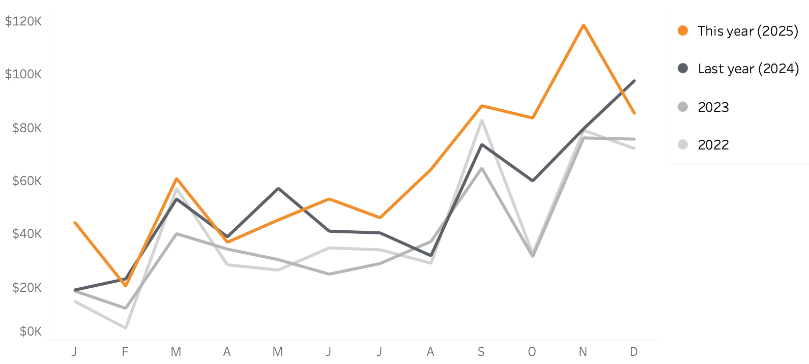
If you’re looking to enhance the clarity and impact of your line charts, this post by Johan de Groot is a worthwhile read!! Line charts are one of the most commonly used visualisations, but small design choices can make a big difference in how effectively they communicate data. Johan walks you through key improvements – from decluttering unnecessary elements to optimising labels and axis formatting. By applying these best practices, you can transform a basic line chart into a powerful storytelling tool that makes trends and insights more accessible to your audience.
What sets this article apart is its practical, easy-to-follow approach to chart refinement. You could be designing dashboards for business analytics, financial trends, or performance tracking – these expert tips will help you create visuals that are not only more aesthetically pleasing but also more intuitive. Johan’s guide ensures that your line charts deliver maximum clarity without overwhelming your viewers.


