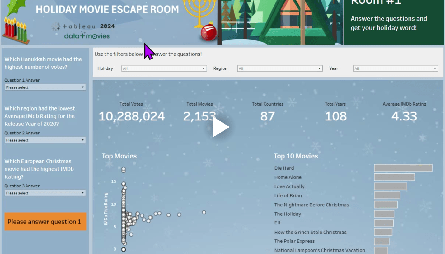
Dawn Harrington (TechTipsGirl) delves into a powerful technique that allows you to dynamically show and hide elements on your dashboard. This ability to reveal or conceal information at the right time adds an interactive touch that keeps users engaged without overwhelming them with too much data at once. The post offers practical advice on how to use this feature to create more streamlined and user-friendly dashboards.
Beyond just simplifying your visualisations, this technique can also enhance storytelling by controlling when and how data is displayed. Whether you’re showcasing a key metric, revealing additional details, or making room for focused insights, you’ll learn how to use Tableau’s dynamic visibility to create a smoother, more intuitive experience.


