Even if Shakespeare isn’t your first love, David Rudkin’s dashboard proves that data can add new layers of appreciation. The visuals are built to invite exploration. And because Shakespeare’s plays are studied and adapted endlessly, seeing fresh perspectives might spark ideas, conversations, or insights you can bring to class, book club, or just your own reading. In short: this isn’t just analytics, it’s a way to see Shakespeare again.
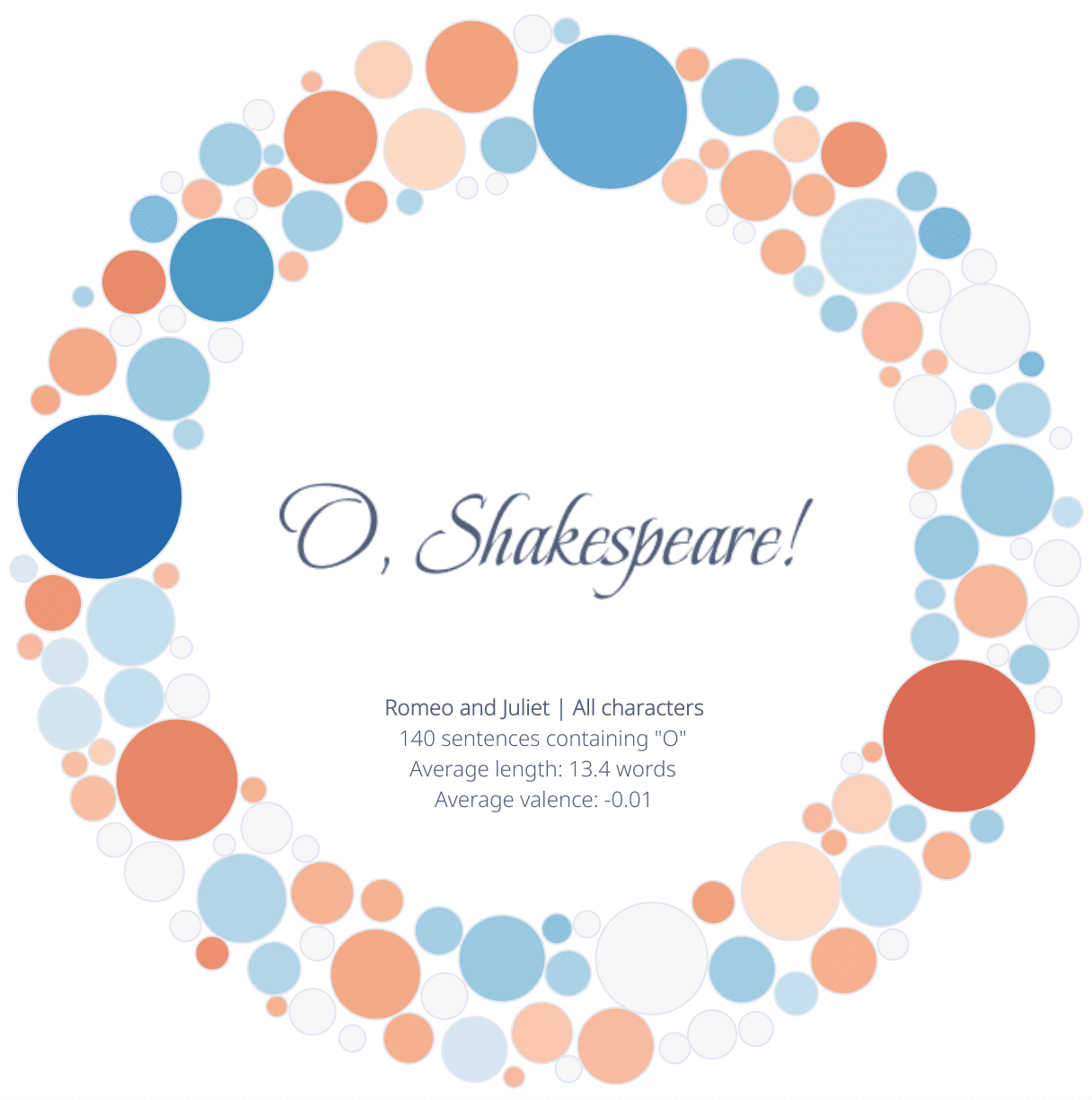

Tableau Training on
Tap Fast Track

Tableau Advanced Analyst

Tableau
Foundation

