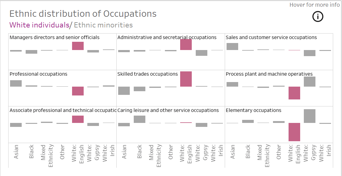
If you’re working with trellis charts in Tableau, you know how powerful they can be for visualising multiple small multiples of data. However, adding clear and dynamic titles to these charts can be tricky. Priya Kondola breaks down the process, as a properly formatted title helps viewers instantly understand what they’re looking at, improving both readability and engagement.
Whether you’re a data analyst, business intelligence professional, or Tableau enthusiast, don’t let missing or unclear titles undermine the impact of your charts, read on today.


