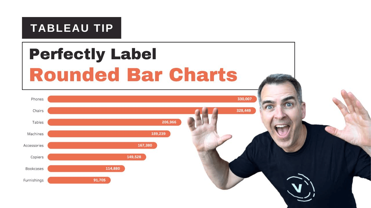
If you’re looking to elevate your dashboards with a sleek and modern touch, this post with Andy Kriebel is a game-changer. This technique not only adds a polished aesthetic to your visualisations but also improves the readability of your data. Andy guides you through the process, ensuring that you can seamlessly integrate rounded labels into your own projects.
Rounded bar labels aren’t just visually appealing, they also provide a more engaging way to present data – capturing the viewer’s attention while maintaining clarity. Andy’s tutorial simplifies what might seem like a complex task, showing that small design tweaks can make a significant impact on your audience’s experience. Read on to learn how to blend data storytelling with design finesse!


