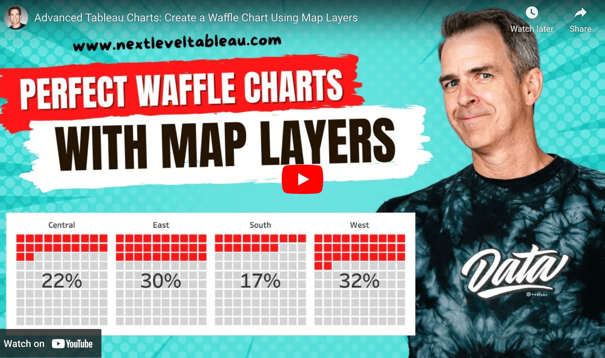
Andy Kriebel, a renowned expert in data visualisation, walks you through an innovative method to build waffle charts using map layers. Unlike traditional approaches, this technique leverages Tableau’s MakePoint function and a waffle chart template to create highly customisable, precise visualisations. He gives fresh insights and techniques that can elevate your dashboards.
What makes this tutorial truly valuable is its focus on efficiency and flexibility. By using Relationships and map layers, you can achieve an accurate, clean waffle chart without the need for complex calculations or extra data reshaping. The step-by-step instructions make it easy to follow along, and the approach opens the door to more creative data visualisation possibilities. If you’re ready to move beyond basic charts and bring more impact to your reports, check out the tutorial and start experimenting with this powerful method today!


