What’s great is that it isn’t just static numbers, it’s interactive, planned to let you filter by country, city, or day so you can really dive in. Zainul Abedin Natha’s project also lays out a thoughtful design: KPIs at a glance, heat maps, bar charts, and detailed views so both the big picture and the day‑by‑day details are clear. It’s a project that brings data to life in a way that’s enlightening, accessible, and relevant.
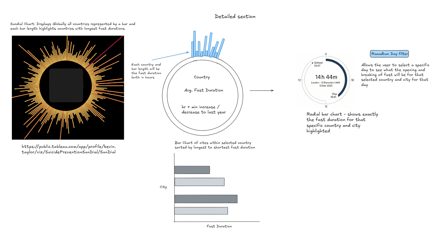

Tableau Training on
Tap Fast Track

Tableau Advanced Analyst

Tableau
Foundation

