What makes Johan de Groot’s post particularly engaging is how it blends design thinking with practical Tableau techniques. Instead of focusing only on aesthetics, it demonstrates how thoughtful layout and interaction can enhance how users explore geographic data. Tableau allows dashboard elements to be styled with features like corner radius and layout formatting – helping creators build cleaner, more modern interfaces that guide users through the story in the data.
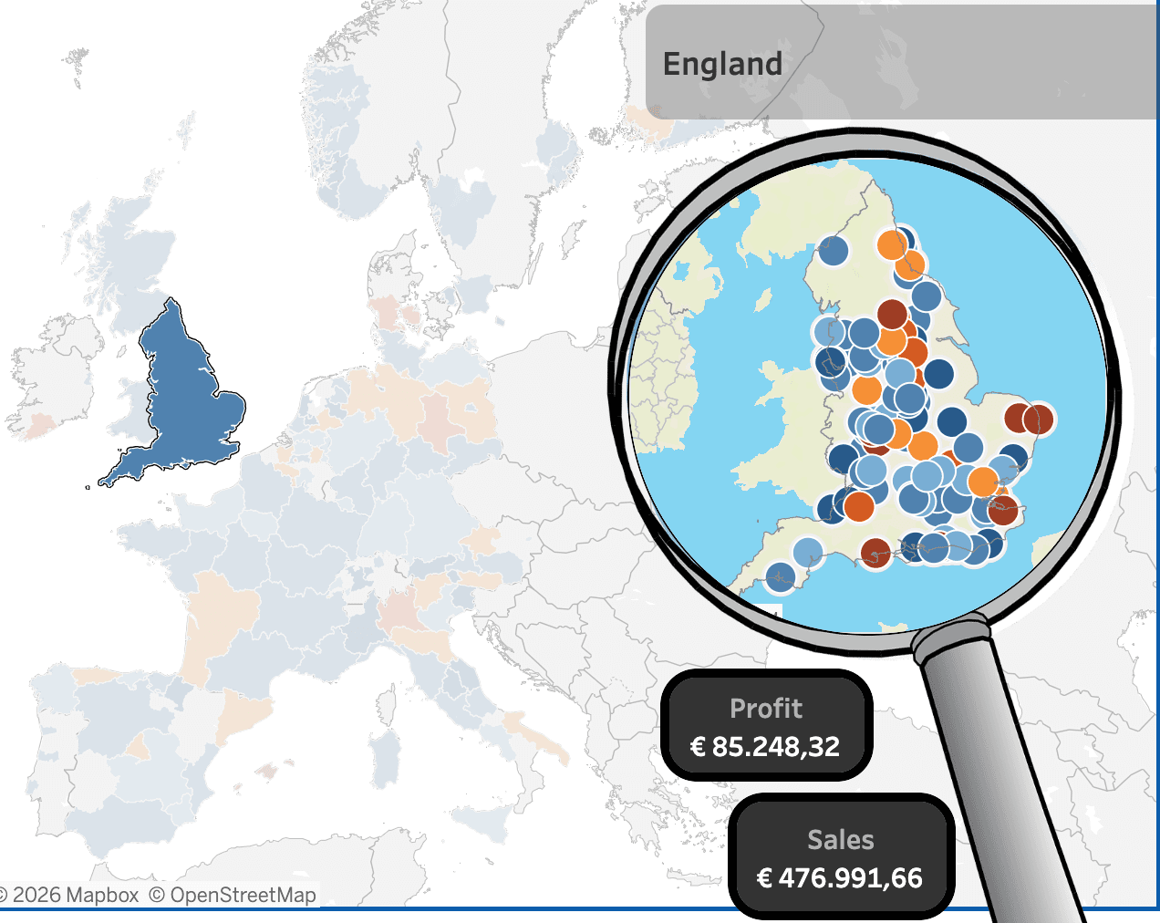

Tableau Training on
Tap Fast Track

Tableau Advanced Analyst

Tableau
Foundation

