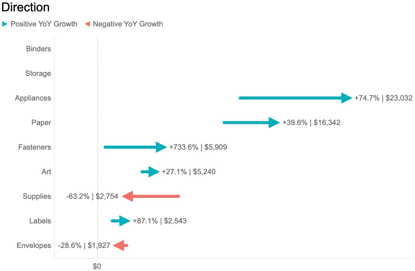
If you’ve ever stared at a year-over-year metric and thought, “Surely there’s a more interesting way to show this than yet another line chart,” Jacob Rothemund has you covered. In this post, he breaks down seven different bar-chart styles that each offer a fresh, intuitive way to highlight YoY changes—whether you want something bold, minimalist, or just plain clever. Tableau users will appreciate how these options balance clarity with a bit of visual flair, making your dashboards feel smarter without becoming noisy. It’s basically a little toolbox of ideas for anyone who wants their growth metrics to look as good as they are.
Seven Bar Charts to Visualise Year-Over-Year Growth
Want to Get Latest Updates and Tips on Tableau Bites Blogs
Sign Up For Newsletter


