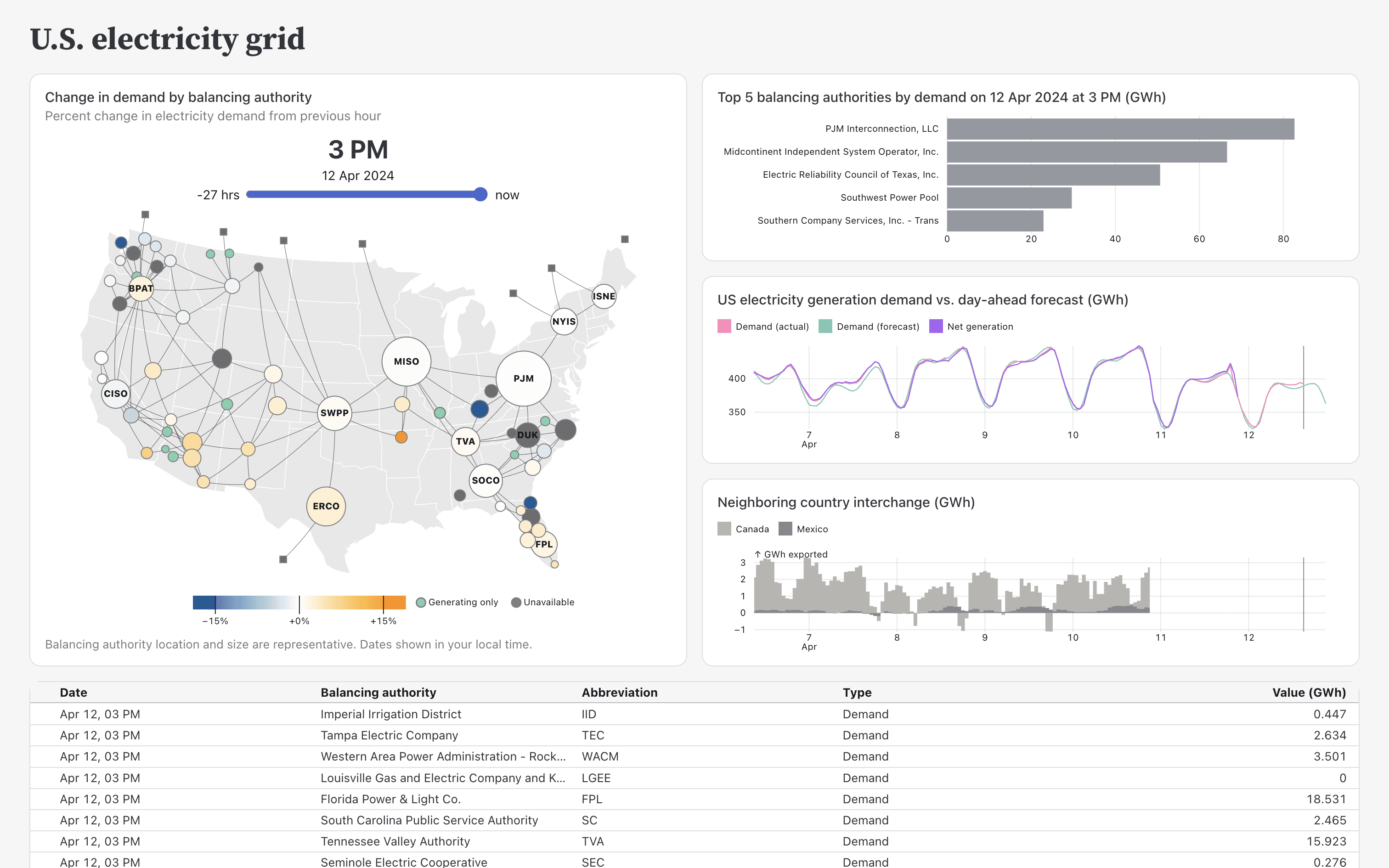
A well-designed dashboard isn’t just about making it look good – it’s about making data easy to understand and act upon. Learn how to refine your dashboard layouts, improve clarity, and ensure users get the insights they need at a glance. Robert Kosara’s article walks you through key design principles – such as establishing a strong visual hierarchy, choosing the right chart types, and avoiding clutter that can overwhelm viewers.
Robert doesn’t just tell you what to do, but explains why these design choices matter. Applying these tips can improve the usability of your dashboards, making them more intuitive and impactful. If you want to take your dashboard design skills to the next level and ensure your audience can easily interpret your data, this is a must-read!


