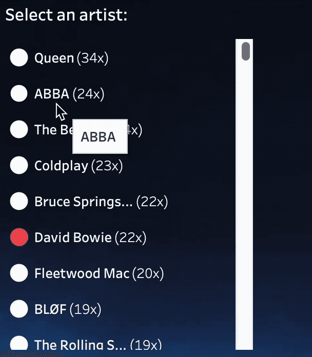
Johan de Groot offers practical examples and clear rationale for why reducing tooltips can lead to cleaner layouts, better storytelling, and more impactful analysis. He challenges you to think differently about how people consume your work. If you want dashboards that communicate clearly and delight users, read on today!
Smarter dashboard design – with fewer tooltips
Want to Get Latest Updates and Tips on Tableau Bites Blogs
Sign Up For Newsletter


