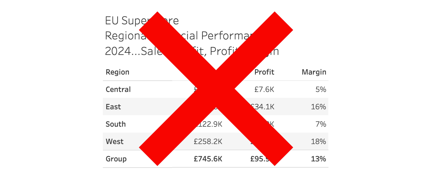
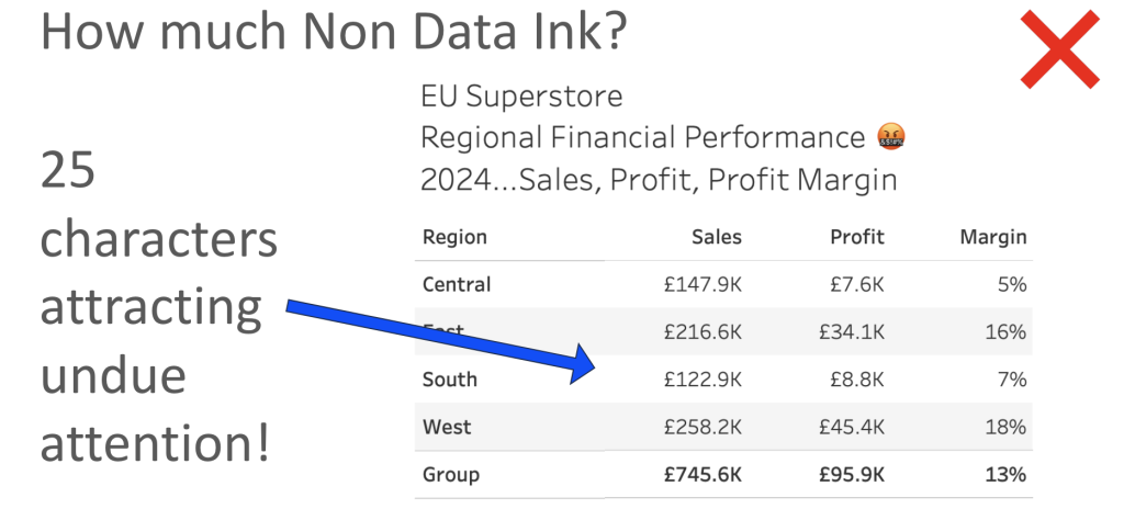
I see this one way too often and it makes my blood boil…
…people repeating the same thing over and over again – at first you see it with currency symbols . On EVERY. SINGLE. NUMBER.
Yep. That was me shouting.
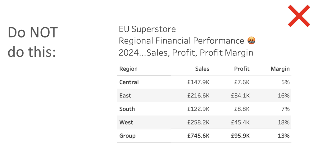
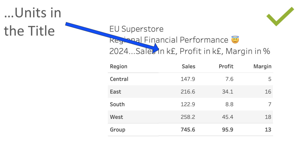
Why do this? I understand people need to know what unit of measure they are looking at – and I know our short term memory is not the best… b-b-b-b-b-ut. Really?
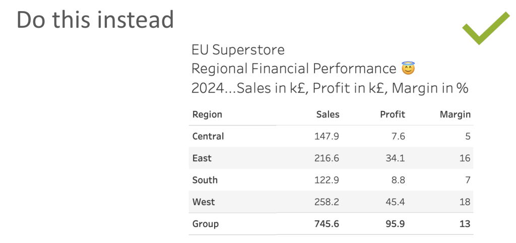
Stick it in the titles and move on.
Its the same with % symbols all over the place.
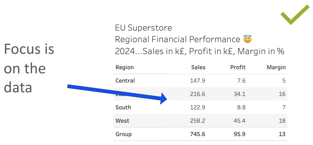
The weird thing is that the people that do this, are often also aware of the non-data ink concept as so well coined by Edward Tufte. Follow that principle as deeply as you can to help clean up your visualisations and help your user focus on the data and the insights.
Below I show some examples that relate to a table, but the same concept applies to chart labels as well. Probably less of an issue in tooltips, to be fair.
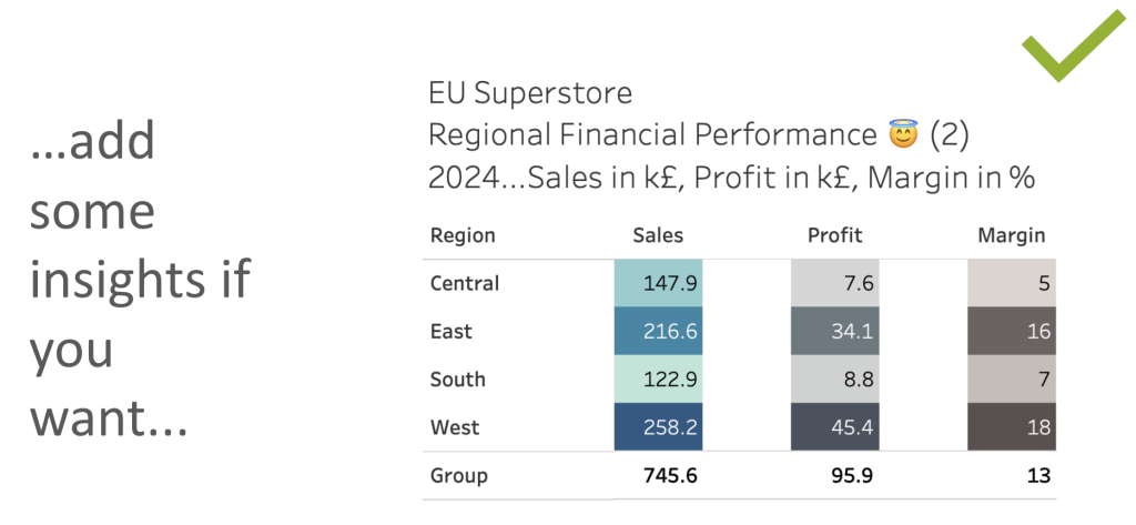
I also steal a technique in the last example from Ray Givler, with the steps detailed…
(Right click on the Measure Names pill to edit the alias’s by the way.)
What do you think? Am I wrong?


