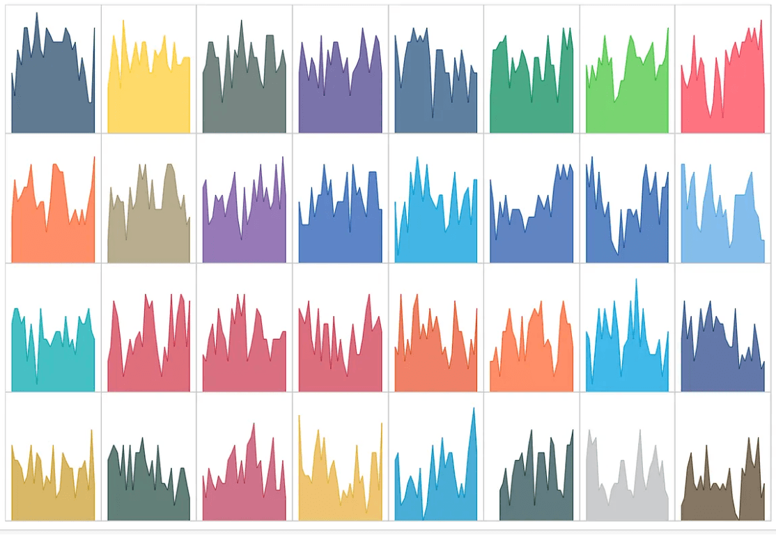
In this practical walkthrough, Blake Feiza demonstrates how surprisingly simple it is to build a trellis chart using just two calculated fields and a parameter to control the layout. Using an example that visualises NFL team wins over time, the guide walks step-by-step through the setup, calculations, and optional design enhancements that turn a cluttered chart into a clear, structured view. If you want a straightforward technique to make your Tableau dashboards cleaner, more comparable, and more impactful, this is a quick and valuable read.
Stop Overthinking Trellis Charts: Two Calculations
Want to Get Latest Updates and Tips on Tableau Bites Blogs
Sign Up For Newsletter


