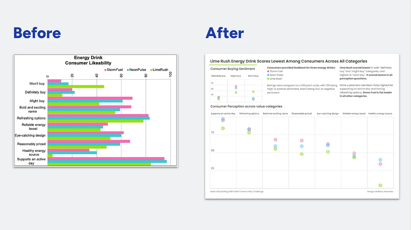
Small design choices – such as how elements are positioned and spaced, can significantly impact how an audience interprets and absorbs information. Brittany Rosenau breaks down practical techniques and real-world examples to help you refine your dashboards.
Mastering space and alignment isn’t just about aesthetics – it’s about clarity, storytelling, and user experience. By applying the lessons from this post, you’ll learn how to structure your data visualisations for maximum impact and readability.


