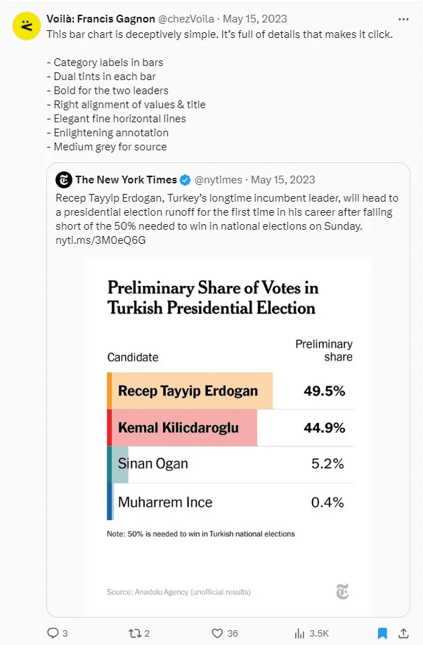
Brittany Rosenau’s post is insightful guide demonstrating how to transform ordinary bar charts into visually-captivating and engaging data visualisations. She shares step-by-step techniques to add flair to your charts while maintaining clarity and usability. Whether you’re designing a report for stakeholders or creating a personal project, these tips will help you make a lasting impression by combining functionality with style.
From unique formatting ideas to leveraging Tableau features in innovative ways, this guide is perfect for beginners and seasoned Tableau users alike. If you’re ready to move beyond standard designs and create bar charts that truly stand out, this post will inspire and equip you to take your visualisations to the next level. Don’t miss the opportunity to learn these transformative techniques!


