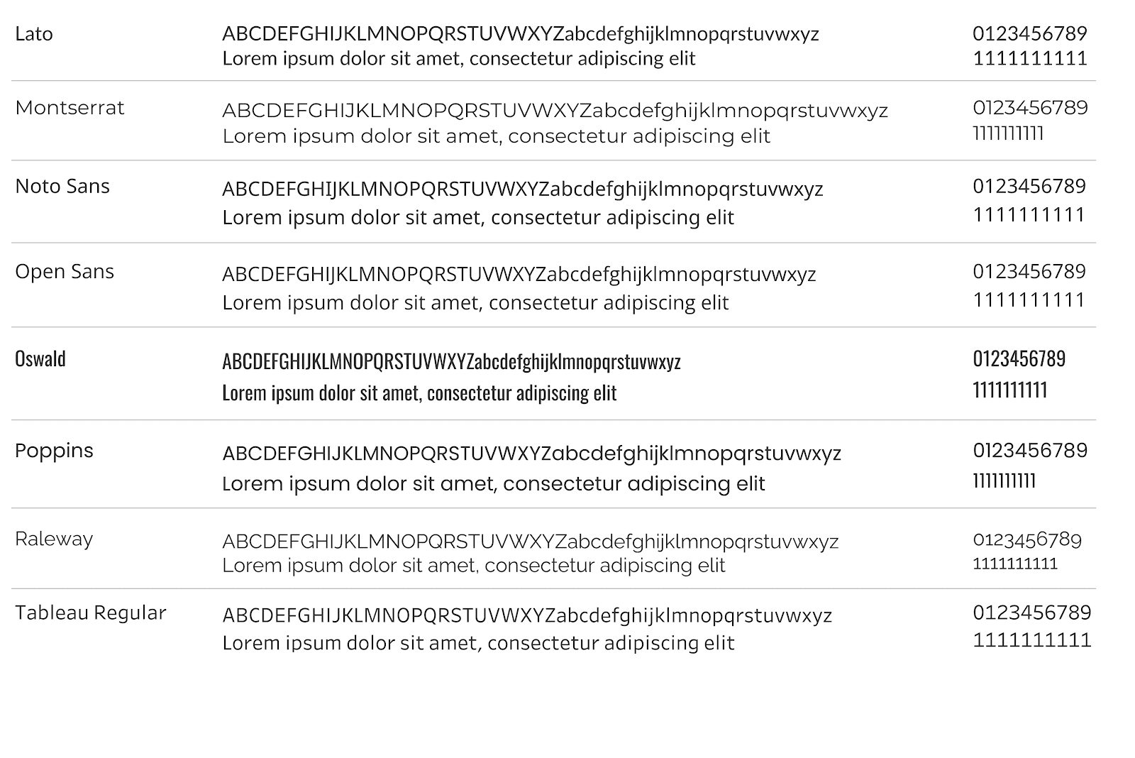
Choosing the right font for your visualisations is crucial, not just for aesthetics but also for ensuring consistency across devices and browsers. This post (with Ken Flerlage) covers which fonts are safe to use in Tableau – helping you avoid issues like distorted text or misalignment when dashboards are shared or accessed on different platforms. It is a simple, yet effective way to boost the quality and professionalism of your work while maintaining full functionality.
Ken’s post also offers practical advice on balancing style with readability, so you can design dashboards that are not only visually appealing but also clear and easy to understand. Whether you’re presenting to an executive team or sharing insights with a broader audience, Ken’s guide will ensure your Tableau visualisations maintain their intended message and impact.


