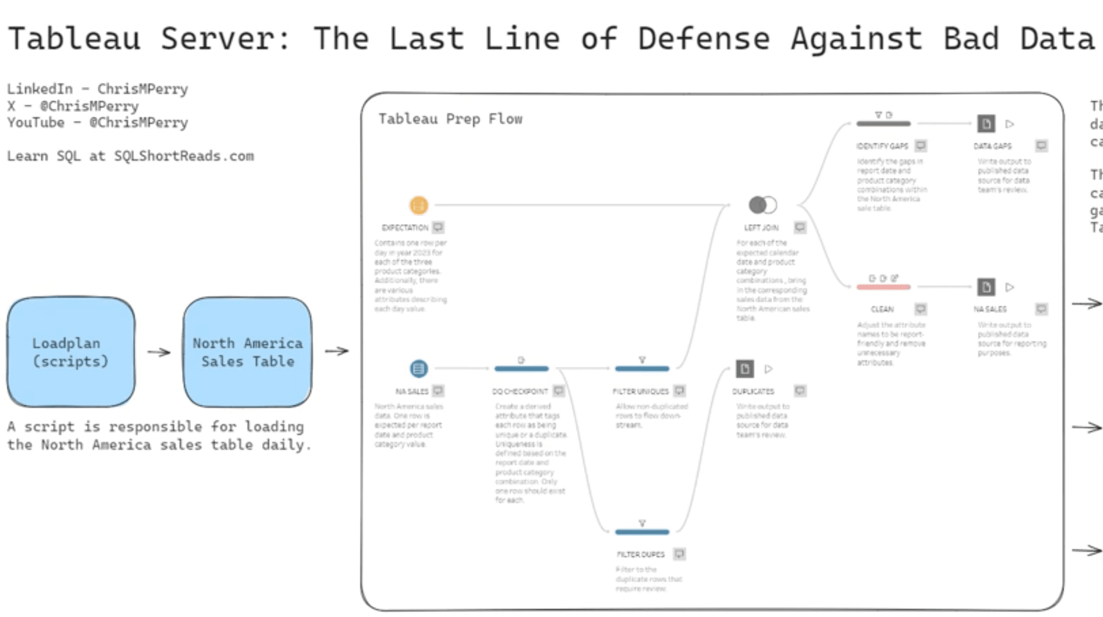
If you’re looking to deepen your understanding of Tableau and its dynamic capabilities, Chris Perry’s tutorial provides a clear and engaging walkthrough of how to create interactive dashboards that not only present data but also allow users to explore it more effectively. He breaks down complex concepts into easily digestible segments – making it accessible for both beginners and those with more experience.
Chris emphasises the importance of user experience in data visualisation. Learn about best practices for dashboard design that not only improve functionality, but also engage your audience. Whether you’re creating dashboards for business presentations or personal projects, this resource equips you with the knowledge to create visuals that are both informative and aesthetically pleasing.


