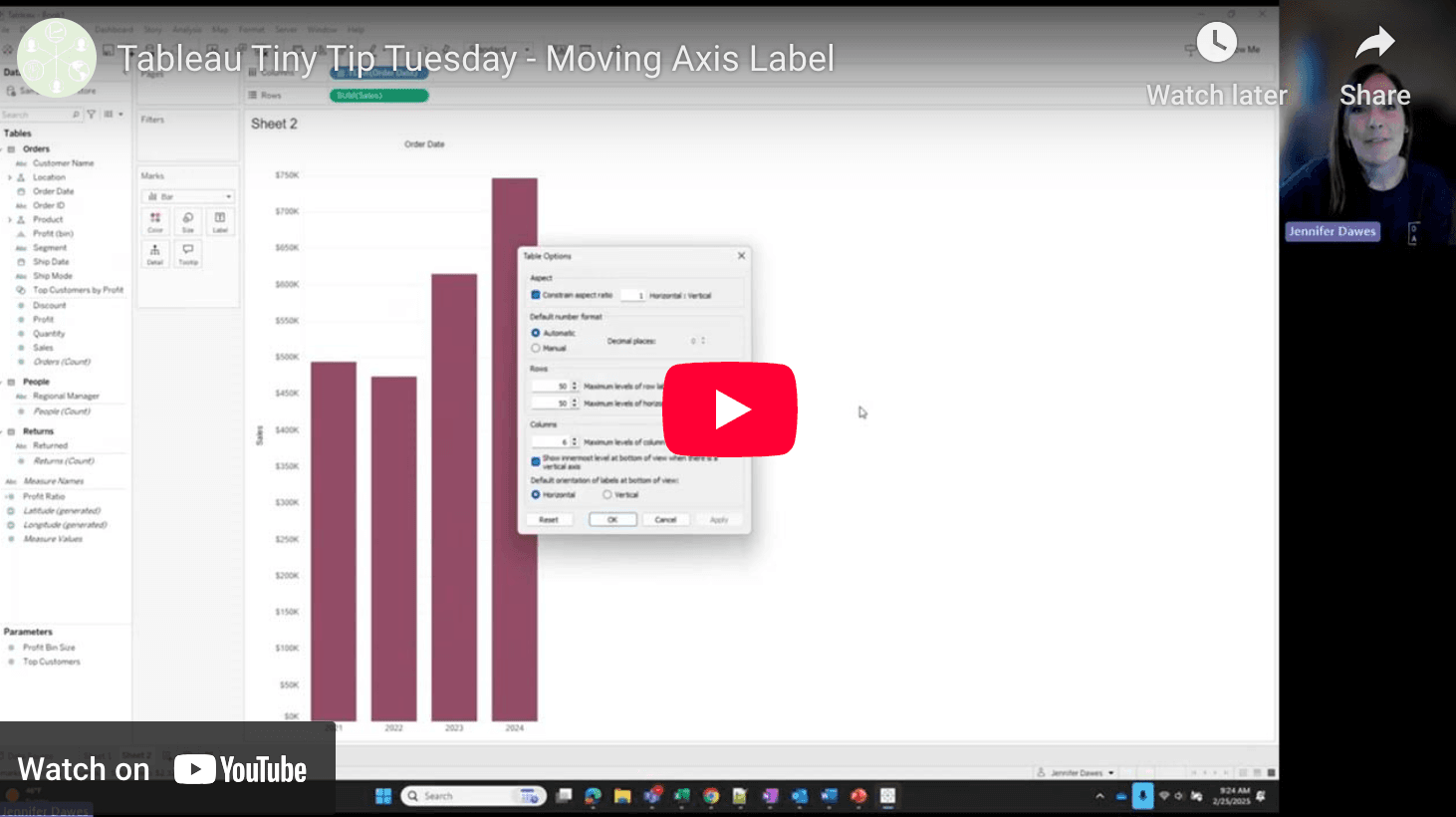
Fine-tuning the small details in Tableau can make a big impact on the clarity and professionalism of your dashboards. Jennifer Dawes shares a simple yet effective trick for moving axis labels to improve readability and visual balance. Whether you’re dealing with crowded charts or just want to create a more polished design, this tip will take your Tableau skills up a notch. Best of all, it’s an easy adjustment that can make a big difference in how your audience interprets your data.
Great design isn’t just about colours and charts – it’s also about the subtle refinements that enhance usability. By learning how to reposition axis labels, you’ll add another tool to your Tableau toolkit that will help make your dashboards both aesthetically pleasing and easier to understand.


