If your dashboard doesn’t know where it’s going, why should your users follow it?
I’ve made this mistake too often: it’s incredibly easy to get caught up in the bells and whistles of dashboard design. You’ve got filters, tooltips, parameter actions, animations – and you want it to look good, feel slick, and impress the stakeholders.
But: if your dashboard doesn’t have a clear purpose, it doesn’t matter how good it looks. It won’t get used. Or worse – it’ll mislead the people it’s meant to help.
The Dashboard Compass™️ is all about making sure that doesn’t happen. It’s about anchoring your dashboard to something more than “features”. Something more than the brief.
It’s about asking one deceptively simple question:
What is this dashboard for?
Not what does it contain or who asked for it. But what is the point of this dashboard? What decision is it meant to influence? What regular behaviour is it supposed to support? What’s the change it’s trying to enable?
Because if you don’t know that – or worse, if you know it but your design doesn’t reflect it – then everything else is just decoration.
A Dashboard Without a Compass Drifts
Think of your dashboard like a boat. You can build the hull, polish the deck, hoist the sails. But without a compass, you’re just hoping the wind blows the right way.
This happens all the time in real projects:
- You start with a clear goal.
- Then a stakeholder adds a new request.
- Then someone else wants a few more charts.
- Then someone else wants the filters to work a different way.
And before you know it, you’ve got a floating mess of metrics, none of which work together.
When you lose the purpose, you lose the plot.
The Compass Principle helps you protect that plot. It becomes your reference point – your way to push back on requests, defend design decisions, and focus feedback.
A Dashboard With a Purpose Builds Trust
A purposeful dashboard isn’t just nice to look at – it feels different to use. It earns the user’s trust, because everything on it is there for a reason.
Users don’t need to work hard to figure out what it’s saying. They don’t need to guess what to do next. The story is clear. The layout is clean. The decisions feel obvious.
And when that happens, something magical kicks in: the dashboard starts getting used. People return to it. They rely on it. They build habits around it.
That’s what we mean by a dashboard that leads.
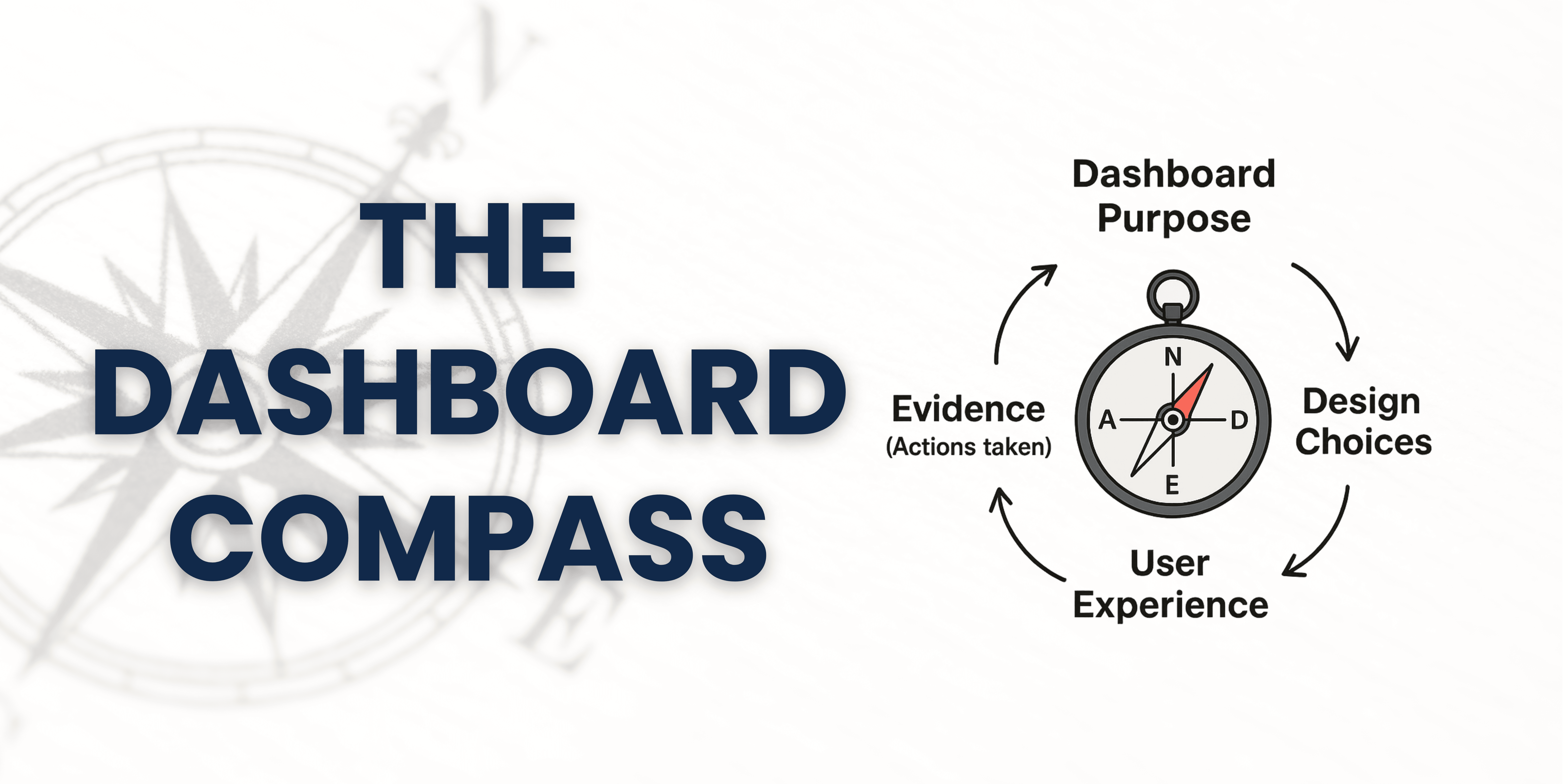
The Dashboard Identity Loop
I’ve borrowed a concept from behavioural science – something called the self-story loop – and adapted it to dashboards.
Here’s how it plays out:
- Dashboard Purpose This is your North Star. Why does this dashboard exist? What change is it meant to drive?
- Design Choices This is where purpose meets layout. What do we show first? What gets priority? What do we not include?
- User Experience When someone opens it, what do they notice first? Where do they click? Do they leave with answers or confusion?
- Evidence (Actions Taken) Are the right people using it? Are decisions being made faster or more confidently? Are the insights triggering action?
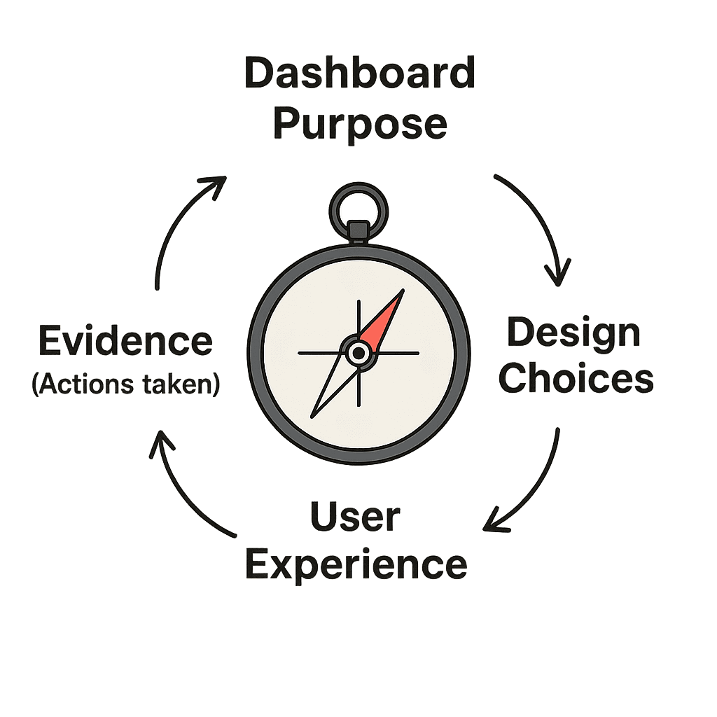
And then the loop repeats. The evidence you see either:
- Reinforces the original purpose (and you improve from a strong foundation), or
- Reveals a mismatch, which means you either refine the dashboard, or rethink its purpose.
A dashboard that gets regular, meaningful use is one that’s had this loop thought through and respected.
Where This Fits in the Powerful Dashboards™️ Framework
This Compass Principle runs through all three phases:
1. Turbocharged Build
Right at the start, when you agree the scope, you’re defining the purpose. This is the compass moment. Without this, every future decision is guesswork.
2. Fast-Track Learning
As you design the charts, you focus on serving the purpose, not showing off the data. Every chart earns its place.
3. Quality Confidence
When you test and publish the MVP, you’re checking if the dashboard still reflects the purpose you defined at the start. If not-it’s back to the compass.
This principle is what keeps your dashboard honest.
The First 5 Seconds Matter
In The Diary of a CEO, Stephen Bartlett shares a simple but powerful idea:
If you don’t win attention in the first 5 seconds, you’ve lost your user.
It’s true for videos. It’s true for presentations. And yes – it’s true for dashboards.
When someone opens your dashboard:
- Can they immediately see why it matters?
- Can they feel its focus before they even click?
- Does it earn trust before it demands effort?
That first impression is everything. If it’s cluttered, confusing, or irrelevant – you won’t get a second chance.
📋 Your Dashboard Compass template
Try This Before You Build Anything.
Before you drag a single chart onto the canvas, try writing this one sentence:
“This dashboard exists to help [audience] make better decisions about [topic], by showing them [key insight] in a way that [clarifies, prioritises, or empowers].”
This is your compass. Put it in your build brief. Put it in the top-left of your wireframe. Put it on the wall if you need to.
Then, use it to:
- Push back on low-value chart requests
- Choose between competing visual priorities
- Frame your training and onboarding for new users
When everyone agrees on the compass, building the dashboard gets easier. Feedback gets sharper. And usage goes up.
Want Help Building Dashboards That Lead?
We do this every week inside the Tableau Insights Collective. If you want:
- Practical feedback on your own dashboard compass
- A way to make sure what you build actually gets used
- And access to training, templates, and coaching from real-world projects…
✅ Join the waitlist to get started.
Or if you’re ready for something more intensive:
📢 I’m running a bootcamp with Tableau Visionary Dawn Harrington. It’s for people who want their dashboards to drive performance, not just describe it.
Message me if you want in – or take a look in our training courses section for the next one.
Appendix: References & Rationale
- Powerful Dashboards Framework: Scope agreement (Turbocharged Build), Design with purpose (Fast-Track Learning), Validate against original goal (Quality Confidence) – Read The Powerful Dashboards Process to Continuous Improvement
- UX Research: Users form opinions about design in milliseconds. Clear hierarchy and intentional layout improve engagement. Google Research: Visual Complexity & Aesthetic Response, 2012
- Behavioural Design: People act when they feel clarity and control. BJ Fogg, Stanford Behaviour Design Lab
This dashboard principle isn’t about the tools you use. It’s about the intention behind them.
Because dashboards without direction? Don’t deserve your effort.
This article was featured in Tableau’s Weekly Roundup.


