How to prevent your dashboard from quietly sabotaging decisions
Imagine this.
You’ve designed a beautiful dashboard. The metrics are accurate. The filters work. The layout looks clean. But then someone takes the wrong action. Or is drawn to the wrong number. Or assumes the trend line means something it doesn’t.
And suddenly? The right data leads to the wrong decision.
That’s not just a dashboard that’s failing.
It’s a dashboard that’s doing damage.
Enter The Dashboard Crash Test.
Just like car manufacturers put vehicles through simulated collisions before releasing them to the public… you can put your dashboards through misuse scenarios before hitting “publish.”
This isn’t about technical bugs.
It’s about visual, logical, and behavioural design.
What if:
- Someone selects the wrong time period?
- Multiple Filters being applied overlap, cancel each other out or confuse?
- A new user opens it alone and misreads a KPI?
- Someone builds a business case based on drilling down in the wrong direction?
The worst part?
None of this feels like sabotage. It just feels like using the dashboard as the designer (you) intended*.*
When dashboards really fail (and how to stop yours)
Technical glitches get noticed and reported back – your users will be quite happy to ‘make some noise’.
But when dashboard get misunderstood, or used in an unintentional way, they fail quietly.
They’re not broken – they’re just misleading. Users don’t raise a bug. They raise the wrong issue in a meeting. They stop trusting the numbers.
If you’re lucky, they export to Excel and find our the truth for themselves. Wow. Did I just say that?
And you don’t hear about it until much later. The solution?
Test your dashboard like it’s about to be misunderstood. Act like an idiot.
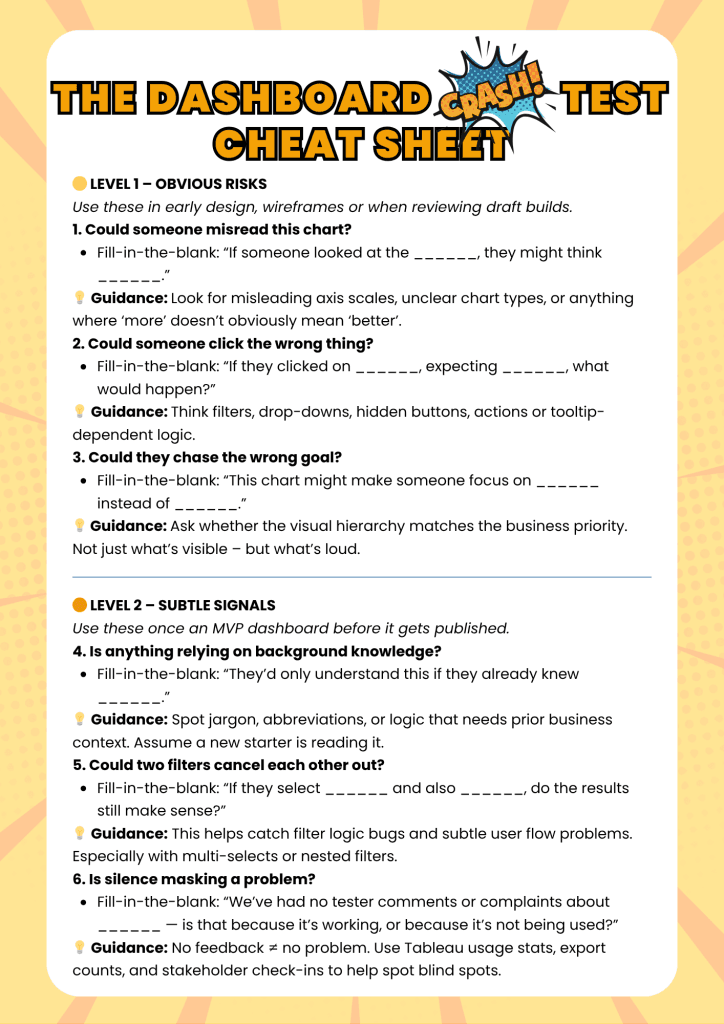
🧪 The Crash Test Flow
At every iteration – wireframe, MVP, pre-launch – ask:
What could be misread here?
(Title, axis, layout, highlight, label, reference line)
What would a new user click that might break the flow?
(Conflicting filters, hidden actions, unread tooltips)
Could someone act on the wrong assumption?
(Is causality implied when it’s not true? (Commonly referred to as ‘Doing a Donald’))
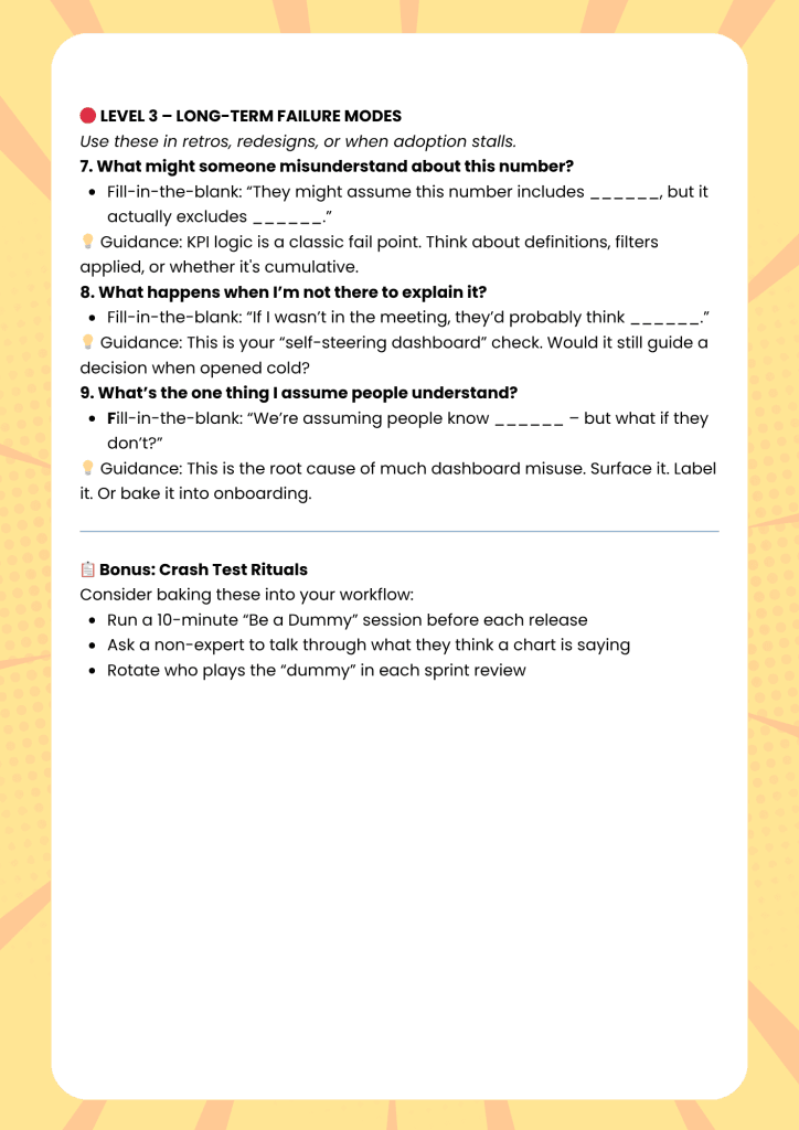
If I wasn’t there to explain it – what might they miss?
What assumption have I baked into the design?
(That people understand the business context, definitions, goals…)
The goal isn’t perfection. It’s about identifying and removing possible failure points.
“Be a dummy.”
This isn’t about mocking your users. It’s about being on their side – assuming nothing, explaining everything, stress-testing before they have to.
Because dashboards aren’t just tools. They’re representatives. And they don’t get a second chance to explain themselves.
Conclusion
The Dashboard Crash Test isn’t just a one-time check. It’s a mindset. You apply it early.
You revisit it often. And each time, you deepen the nuance – not just “is it clear?” but “could this be used wrong?”
If you’re building dashboards that matter, this test isn’t optional.
It’s your safety belt.
Want help making sure yours don’t crash?
Join the Tableau Insights Community – where you’ll get frameworks, coaching, and feedback from other pros who want their dashboards to survive contact with the real world.
Because powerful dashboards aren’t just pretty.
They’re hard to misuse.
This article was featured in Tableau’s Weekly Roundup.