Don’t be a sausage……machine.
Most dashboards are sausage machines. Yours doesn’t have to be.
Take every stakeholder request. Mince it all together. Press it into a single view.
Congratulations. You’ve just made another dashboard sausage.
It might tick every box… but nobody really wants it.
Because no matter how well-seasoned it is, it’s still a mystery mix of compromises.
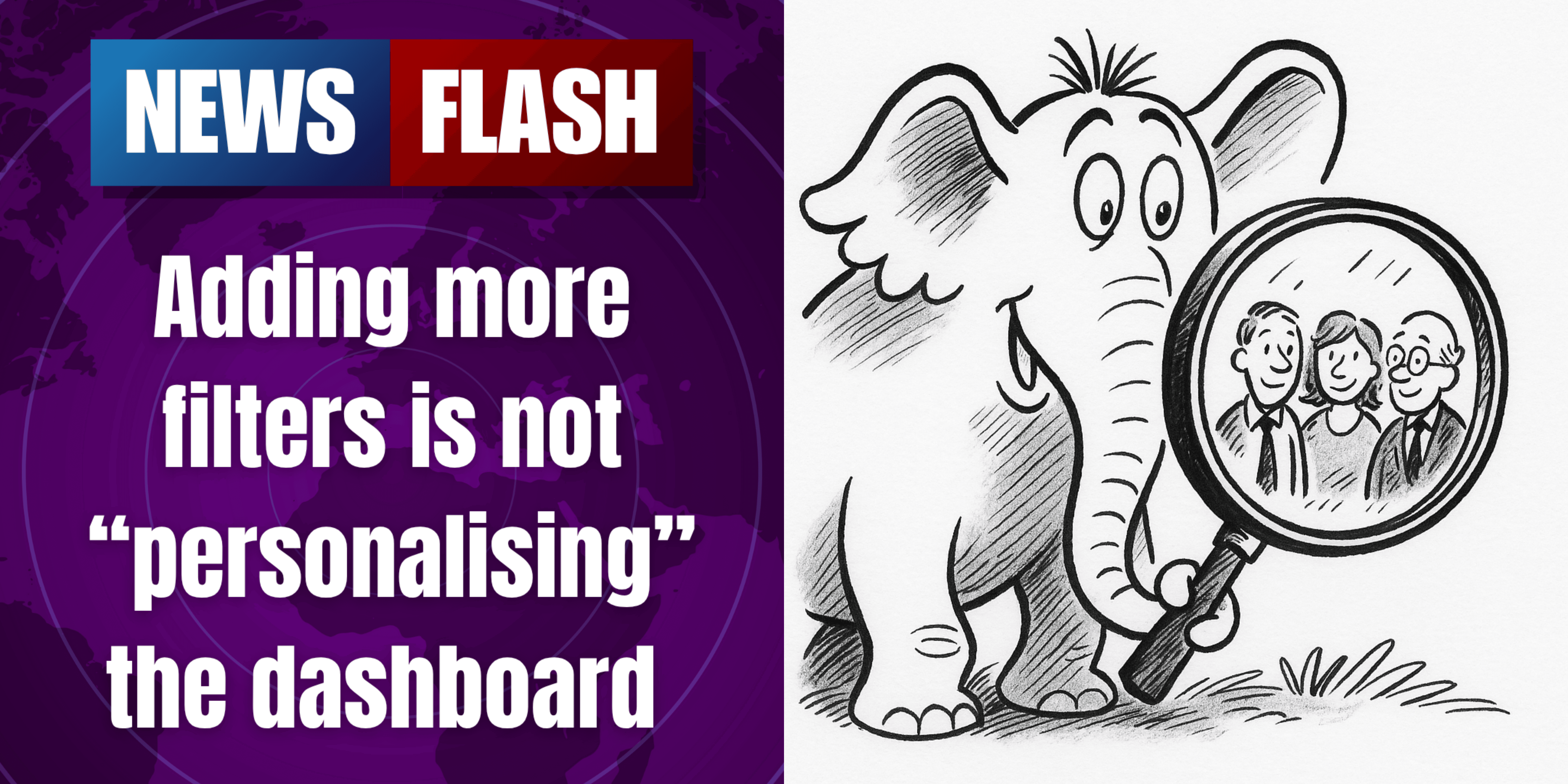
Why “One Dashboard for The Board” is a dangerous delusion
When someone says, “This dashboard is for the senior team,” what they often mean is:
“I built one view and hoped it made sense to everyone.”
But job titles aren’t user needs.
Your CXO1 wants real-time ops levers. Your CXO2 needs monthly trends and deltas. Your CXO3’s watching pipeline or churn or wait times or satisfaction or …
Trying to satisfy them all with one dashboard is like handing them a single sausage and saying, “There’s something for everyone in here.”
It’s not clarity. It’s confusion.
There’s a better way: The Deli Counter.
At a deli, you don’t hand out pre-packed slices and hope they fit. You ask. You serve. You tailor.
That’s what the best dashboards do:
- Start with understanding each stakeholder’s decision style, trust level, and data literacy
- Pre-build tailored views that match their appetite
- Offer meaningful options (not just drop-downs)
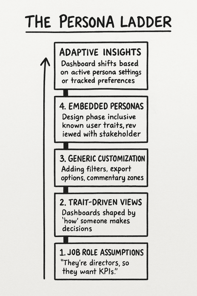
The Persona Ladder (Visual Model)
We call this evolution The Persona Ladder. Here’s what it looks like:
- Job Role Assumptions – “They’re execs, give them KPIs”
- Generic Customisation – Filters and toggles galore
- Trait-Driven Views – Views aligned to decision style and trust profile
- Embedded Personas – Defined early, mapped to design
- Adaptive Insights – Dashboards that flex based on user traits or settings
Most organisations get stuck between Levels 1 and 2. To get real traction, you need to climb.
[Insert canva version of the below with only the headlines in each box:]
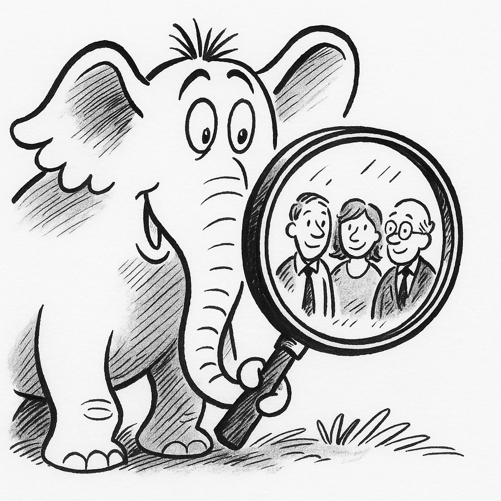
Filters aren’t personalisation. They’re delegation.
Adding more slicers and drop-downs? That’s not design. That’s outsourcing.
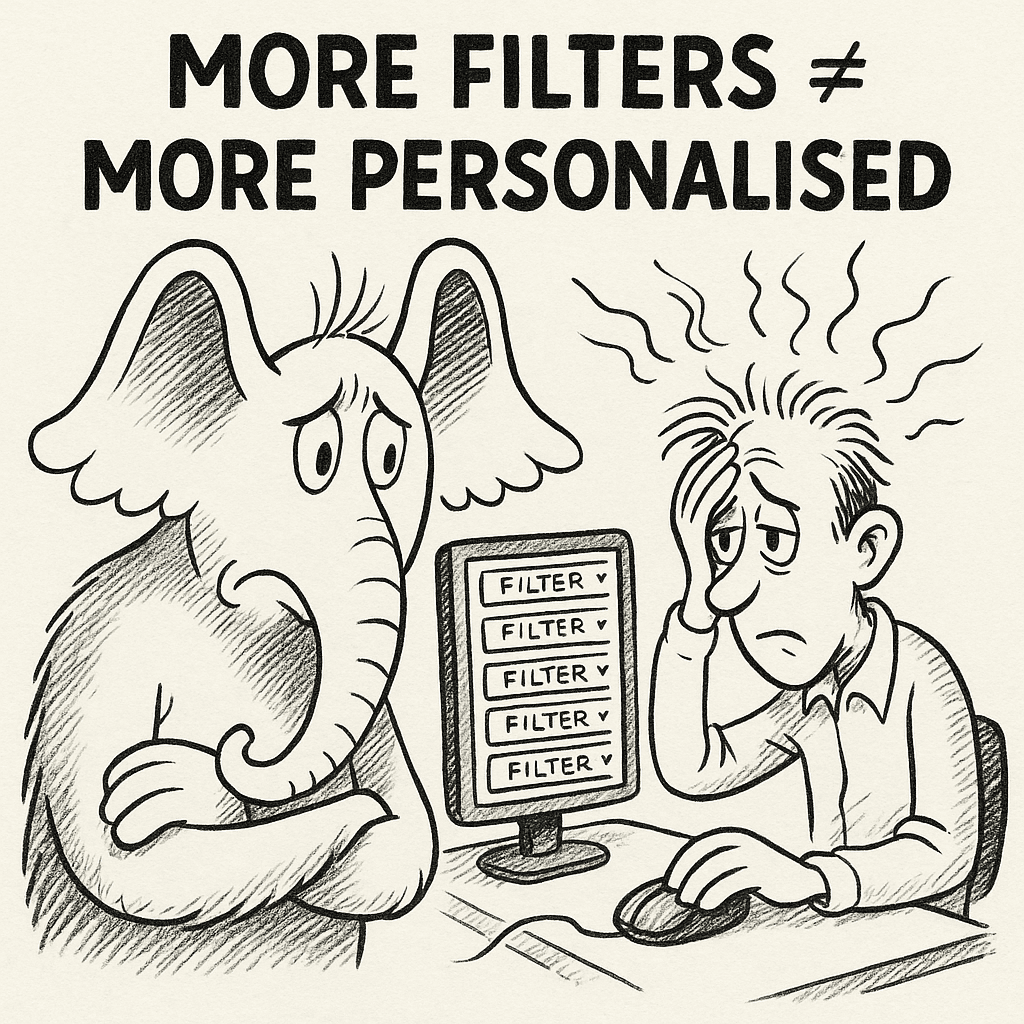
Imagine walking into a deli and being handed a meat grinder and a pile of ingredients. “Here you go – make your own.”
Exactly.
This isn’t UX theory. It’s dashboard survival.
In our Powerful Dashboards Framework, “Scope Agreed” isn’t about what charts they want. It’s about what outcomes they’re chasing.
The questions we ask:
- What do you need to spot?
- What do you need to decide?
- What do you never want to be surprised by again?
Luca said, “This is the first time I’ve seen a dashboard that actually thinks like we do.”
And Steve Y managed to get the majority of his stakeholders opening their dashboards on a daily basis.
You don’t get that with sausages. You get it with service.
Want to learn how?
The next Visual Analytics Best Practices course starts 02 June. It teaches this exact mindset – and how to use Tableau to deliver it fast. Details here.
🎁 Bonus: the full course fee becomes a credit towards our annual Tableau Insights Collective.
So if you’re ready to stop guessing, and start serving? Step away from the sausage machine. Head to the deli.
Appendix: Sources & Credibility
- NN/g on Persona-based design: https://www.nngroup.com/articles/persona/
- Testimonial evidence: Verified via internal video transcript from Luca & Steve Y
- Dashboard Method: https://vizdj.com/visual-analytics-best-practice/
This article was featured in Tableau’s Weekly Roundup.


