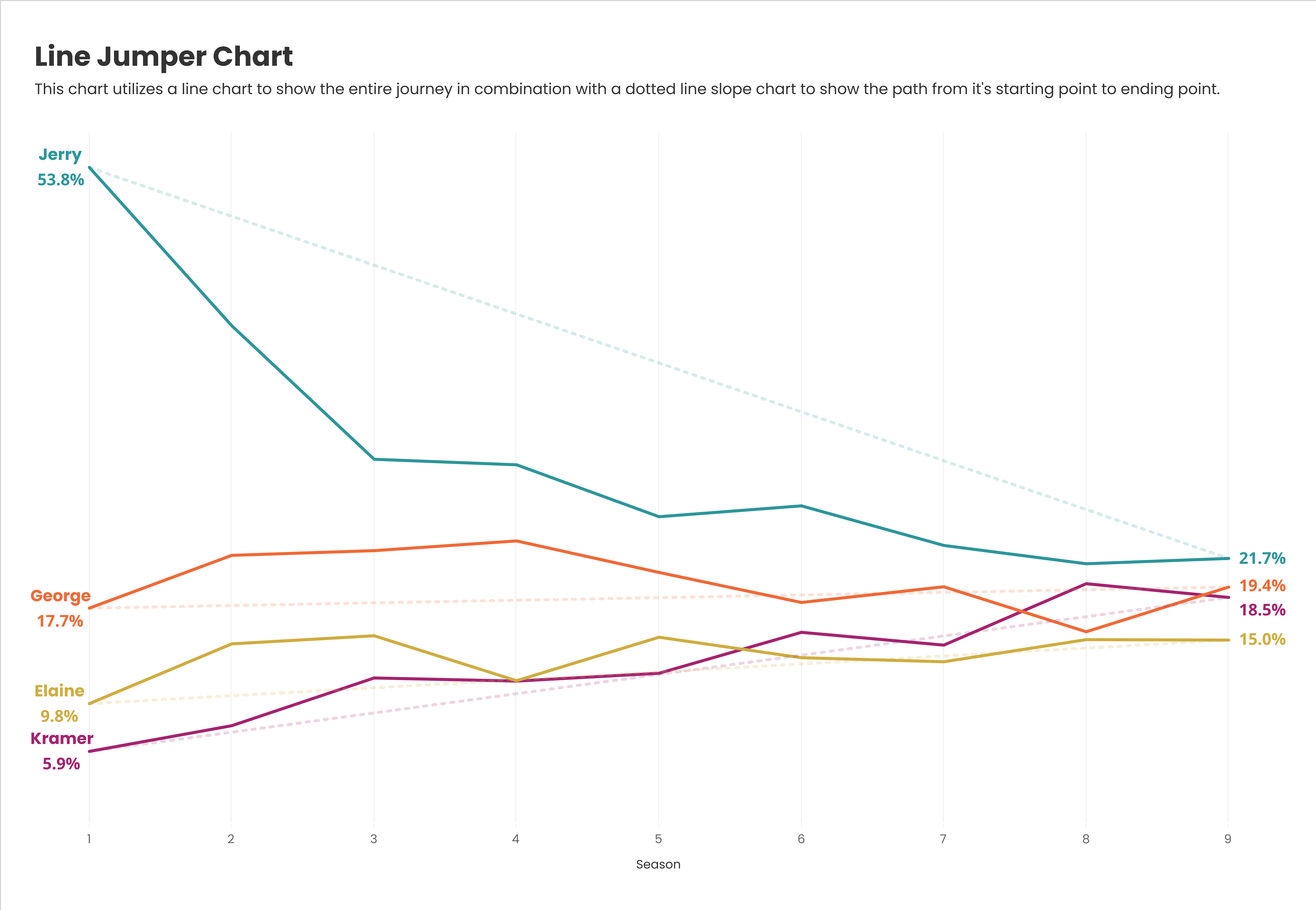
Data visualisation is all about clarity, and the Line Jumper Chart is a game-changer for making overlapping data easier to read. This technique helps ensure that important trends don’t get lost in visual clutter, making your data more accessible and actionable. Kevin Flerlage guides you through it.
If you’ve ever struggled with messy, hard-to-interpret line charts, this is the solution you need – allowing you to present complex data more intuitively by reducing overlap and improving visibility. Kevin’s clear explanations makes it easy to apply the method to your own work. Don’t let your insights get buried – learn how to create cleaner, more effective visualisations today!


